David Bailey-'Its like being a vampire, I want to capture their personality.'
|
|

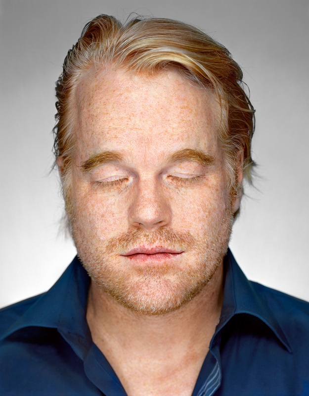
David Bailey is an English fashion and portrait photographer. Bailey developed a love of natural history, and this led him into photography. He had determined to pursue a career in photography so he bought a Canon rangefinder camera. In 1959, Bailey became a photographic assistant at the John French studio, and in May 1960, he was a photographer for John Cole's Studio Five, before being contracted as a fashion photographer for British Vogue magazine later that year. In David Baileys images, you can see how the models eyes play a role. In some of the images, the models eyes are closed which makes you see the other parts of the model more clearer. In the images with the models eyes that are open they almost seem luring which makes you feel uncomfortable. You see the eyes first and then begin to see the other parts of the image. I feel as if when you can grabs someone's attention with a simple part of an image is extremely effective as it shows you how photographers have to get things almost in the right place for something to work well.
I like David Baileys work as it really does grab your attention and some people may see the images as normal portraits but as photographers, you can really get an insight to what the artist has attempted to complete.
I like David Baileys work as it really does grab your attention and some people may see the images as normal portraits but as photographers, you can really get an insight to what the artist has attempted to complete.
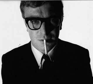
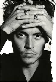
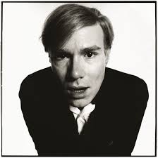
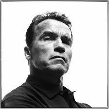
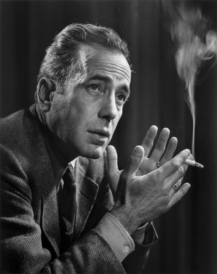
Michael Caine by David Bailey,
bromide print, May 1965,
16 1/8 in. x 16 in. (409 mm x 407 mm)
This image of Michael Caine really stood out to me as there is s many elements that David Bailey used and it resulted in this extremely effective image.
VISUAL:
This image has a few clear areas starting with the cigarette. It makes the image a lot stronger as it is a bright colour which in contrast to his dark suit. Furthermore the slanted cigarette is juxtaposed with his neat hair, structured suit and perfectly positioned glasses.
There is also a balance of positive and negative space. The dark, bold suit, tie and glasses are contrasted with the collars, cigarette and background making this image have a 50/50 positive/negative space.
The eyes are also a big part of this image as is one eye clearer than the other. David Bailey might have intended on doing this as he wanted his images to bring out peoples personalities. The one eye that you can see can seem quite uncomfortable as it appears to be staring at you. This feeling of discomfort also comes across with the shadowing.
The shadowing in this image is extremely effective as it brings different emotions about Michael. The lighter side of him has his features standing out more and this makes it easier to see his personality. We get a sense that he is a good person as his face is lit which can make you feel more comfortable. However, the shadowy, darker side of his face makes you feel uneasy as you can’t see his features. It makes him look evil which causes discomfort to the viewer. It may not seem clear but, Michael is leaning towards the camera slightly. This gives the image dimension and makes it look 3d, which makes the image more interesting to look at. I like this idea as even though an image is 2d, you can make it 3d with a few small changes.
David Bailey was clever with his use of composition aspects and within this image, there is a long leading line. It starts at his tie which is bold and eye-catching, then it flows through the cigarette, to the dimple under his nose, to his nose and ends at the dimple in his forehead. This is a dominant line as it creates movement through the image.
CONTEXTUAL:
Biographical- David Bailey might have been inspired to take this image from childhood problems. Growing up with dyslexia, he had problems in his childhood and he may have been bullied. As a result of this, he may have wanted to show that every person has a dark side to them.
Psychological- When I see this image, I feel uncomfortable as many elements are used that brings an uneasy look to Michael Caine.
TECHNICAL:
In a studio, he would have had the left light shining on his face, making it glow whereas the right light would be extremely dim or, turned off completely to create the shadow effect.
CONCEPTUAL:
You can see the difference between this image and images taken by Martin Schoeller. Martin’s images are more of a complete face shot which brings emotion through eyes and David’s image brings emotion through the models face and the cigarette. This said, they both use lighting which effects the mood of the image and without the lighting, the images wouldn’t be as strong.
Richard Avedon-'All photographs are accurate. None of them is the truth.'
|
|
Richard Avedon was an American fashion and portrait photographer. He was born in New York in 1923 and died in 2004. The photographer's influence was his younger sister, Louise. During her teen years she struggled through psychiatric treatment and eventually became increasingly withdrawn from reality and was diagnosed with schizophrenia. These early influences of fashion and family would shape Avedon's life and career, often expressed in his desire to capture tragic beauty in photos. In 1944, Avedon began working as an advertising photographer for a department store, but was quickly endorsed by Alexey Brodovitch, who was art director for the fashion magazine Harper's Bazaar. Lillian Bassman also promoted Avedon's career at Harper's. In 1945 his photographs began appearing in Junior Bazaar and, a year later, in Harper's Bazaar.
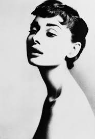
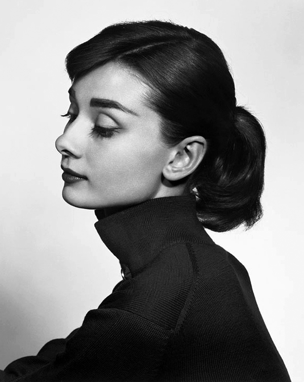
I have an interest towards Richards images as the way his images are in black and white are appealing. They are easily recognisable and his use of lighting is interesting as they bring emotion to the image. In particular, I like how some of his images have shadowing as they make the image more stronger for example, In his Audrey Hepburn image, you can see the outline of her body giving it a more defined shape.
I have an interest towards Richards images as the way his images are in black and white are appealing. They are easily recognisable and his use of lighting is interesting as they bring emotion to the image. In particular, I like how some of his images have shadowing as they make the image more stronger for example, In his Audrey Hepburn image, you can see the outline of her body giving it a more defined shape.
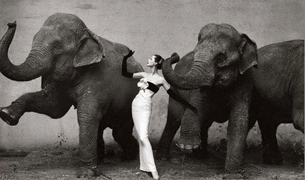
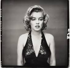
Dovima with Elephants by Richard Avedon, Evening Dress by Dior, Cirque d'Hiver, Paris, 1955.
This image by Richard Avedon is one of my favourite images from his series as I really like the elements that he has used.
VISUAL:
The woman in this image stood out to me first creating her to be the focus point of the image. To me, there is an unbalanced positive/negative space as she appears to be the positive space and the rest of the image is the negative space. Her dress and the background is light whereas the elephants are dark. This could show how humans are ‘inferior’ as the model is portrayed as glowing and angelic.
There is more light on the top half of the image as the bottom half has shadows. I think the lighting is reflected to bounce back onto the dress, making it glow. The elephants look content and the lighting may have made this emotion come across clearer.
There is also juxtaposition within this image which is achieved by the symmetry between the elephants and Dovima (model). The dirtiness of the elephants complements the cleanliness and elegancy of the model as well as the elephants’ rough skin and the smooth fabric of the dress.
I like how the elephant’s trunk and the models arm are the same shape and tone as it creates repetition in the image which brings emotions. We get the feeling that the elephant and the human have a connection as they seem to have the same arm/ trunk pose.
The dominant lines in this image are mostly curved as the shapes that stand out the most of the elephant and the model are curved. This is effective as the indicate movement through the image as our eyes are trailed down these lines.
The image seems 3d as against the lighter background, the animals and the model appear to be popping out. The shadowing at the bottom of the image creates this effect as well as the contrast in colours as the figures are darker and the background is lighter.
The white of the dress was most likely intended as it creates many effect such as positive/negative space, contrast, emotion and dimension. If the dress was a darker colour, the image wouldn’t be interesting as it would look dull and boring.
CONTEXTUAL:
In all of Avedon’s art he stresses old age and this comes across in this image through the wrinkled elephants.
The chains around the elephant’s feet may represent the idea of a reduced life. He might have done this as in his younger years, he worked as an army photographer which could have shown him how hard their lives are. When I see this image, I feel captivated as boldness of the image catches my eye.
TECHNICAL:
I think that this image would have had a reflector on the model as she appears to be glowing and a reflector creates this effect. The shutter speed would have had to be quick to capture the stillness of the elephants.
CONCEPTUAL:
I feel as if this image helps to show elegancy and how having a hard life isn’t always bad. This is because although the elephants are chained they still look happy.
This image can influence my work as I think that it will be interesting to show overcoming life issues in images.
Martin Schoeller-'I think all photographs lie. They capture such a small amount of a person's personality, if
they capture anything.'
|
|
Martin Schoeller is a New York based photographer whose style is of hyper-detailed close ups. His work is recognisable from the portraits he has taken, shot with similar lighting, backdrop and tone. He has been a staff photographer at 'the New Yorker' since 1999. In his early years he was influenced by photographers August Sander,Bernd Becher, and Hilla Becher. Schoeller studied photography at Lette Verein in Berlin. He worked as an assistant for Annie Leibovitz from 1993 to 1996, here he developed his "big head" portrait technique, a term coined by him, of his style of "hyper-detailed close ups", which later gave him worldwide acclaim
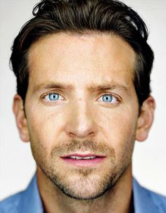
One thing in particular that I like about Martin Schoeller's work is the way the peoples eyes are brought out. In his images, you can see how eyes play a huge role as they are the first thing that you see. The eyes can create emotion as some may make you feel quite happy whereas some may make you feel uncomfortable. I also like his style of close ups as you aren't distracted by anything else in the image and stereotypical views of men/women aren't given out.
One thing in particular that I like about Martin Schoeller's work is the way the peoples eyes are brought out. In his images, you can see how eyes play a huge role as they are the first thing that you see. The eyes can create emotion as some may make you feel quite happy whereas some may make you feel uncomfortable. I also like his style of close ups as you aren't distracted by anything else in the image and stereotypical views of men/women aren't given out.

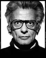
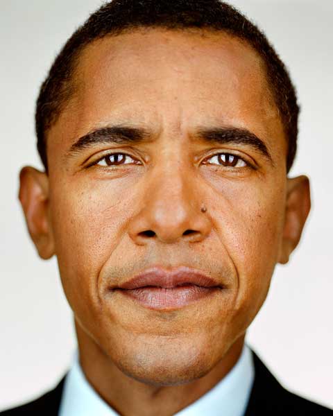
Barack Obama,
Martin Schoeller,
Digital C-print, 2004
Variant published in Gentleman’s Quarterly, December 2004,
Collection of the artist, courtesy Hasted Hunt, New York City,
© Martin Schoeller
VISUAL:
The area that appear sharpest in this image is his eyes. This is because eyes in Martin Schoellers images play quite a big role of captivating the viewer and cause them to feel different emotions. The eyes of the person is brought out and in this image in particular, it makes the person seem powerful. We know that this sense of power is in this image as it is indeed of the president but, this is brought to you through the way the image was taken.
Martin Schoeller also uses a depth of field as the persons face is in complete focus whereas the rest of the image is blurred. This is effective as it only shows the persons face so you don’t get any other view on them.
The lighting in the image gives you a clear view to the persons face as there isn’t any shadows that hides one side but, it is all clear and well lit. The light looks soft as the skin of the Obama seems as if it is glowing.
The background colour of this image is significant as if it was any other colour, it can change the mood and emotion of the image.
CONTEXTUAL:
When I look at this image, I feel respectful and understanding towards the person. The eyes are luring and this makes you feel as if you know the person as they have a stare that seems as if the image is real.
TECHNICAL:
This image has studio lighting and a reflector was used and you can see this as the light is almost perfect and has a soft glow to it.
Also, the focal point is the face as the rest of the image is blurry.
The shutter speed must have been quick to create an image that seems still and almost drawn.
CONCEPTUAL:
This image is different to other photographer’s images such as Richard Avedon. Michael Schoeller creates emotion through eyes and does close ups whereas Richard uses body language and movement to create emotion.
His images help to communicate that you don’t portray celebrities or humans by one perspective but if you see them in another way, you now they have different behaviour.
I can be influenced by his work as I know that you can create emotion from one part of someone and capture them when they seem different so they are viewed in other ways.
Gregory Crewdson-' Every artist has a central story to tell, and the difficulty, the impossible task, is trying
to present that story in pictures.'
|
|

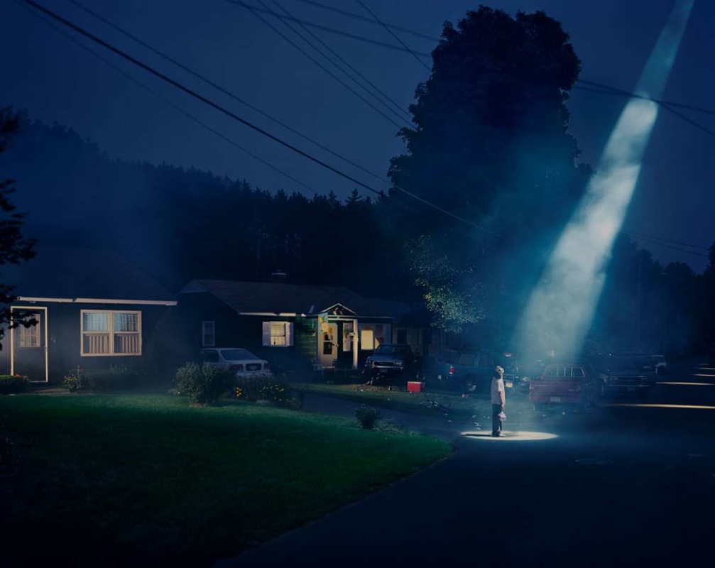
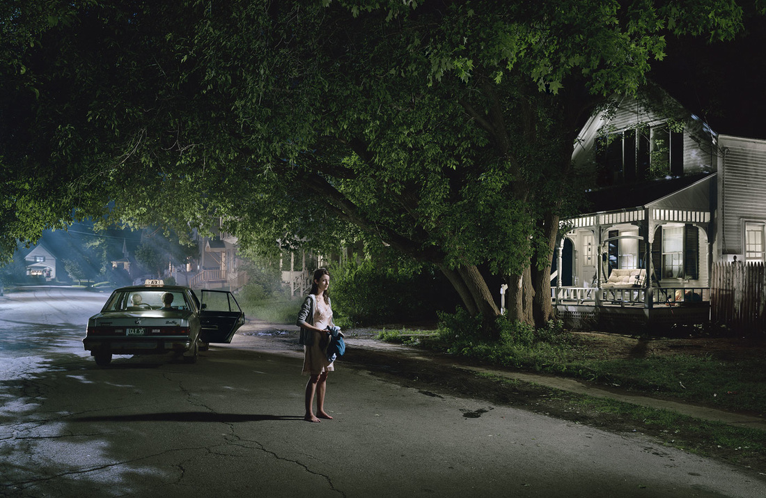
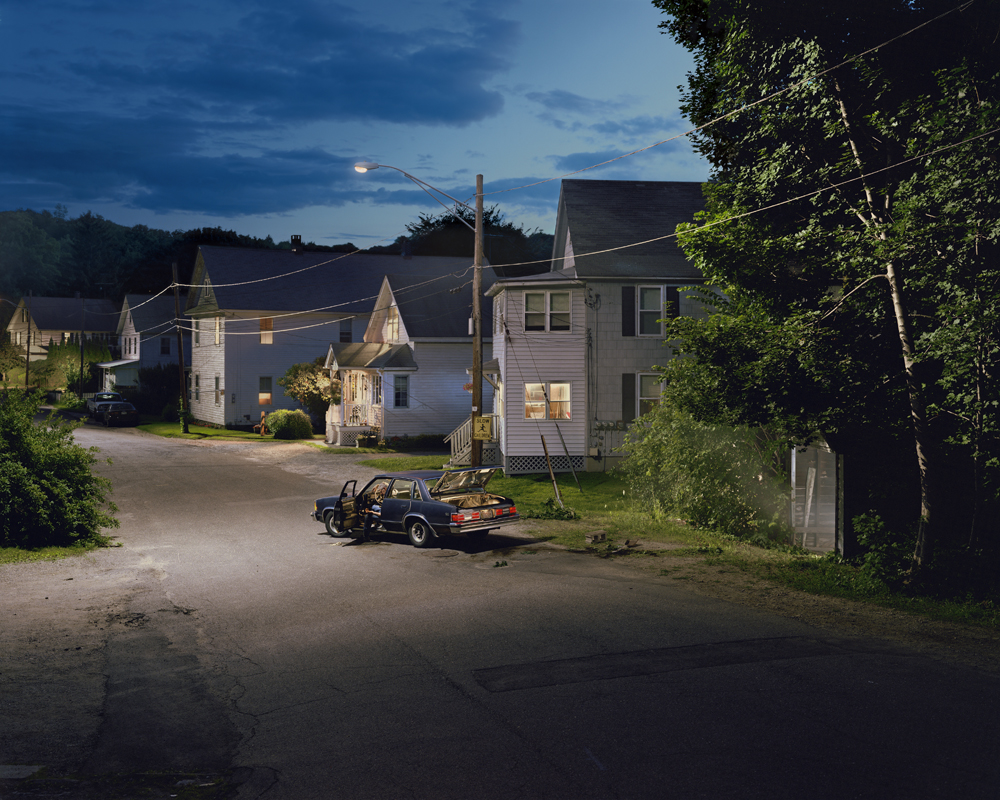
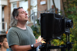
Gregory Crewdson is an American photographer that photographs tableaux of American homes and neighbourhoods. In the mid 1980s, Crewdson studied photography at SUNY Purchase, near Port Chester, NY. He received his Master of Fine Arts from Yale University. Crewdson's photographs usually take place in small-town America, but are dramatic and cinematic. They feature often disturbing, surreal events. His photographs are elaborately staged and lit using crews familiar with motion picture production and lighting large scenes using motion picture film equipment and techniques.
Gregory Crewdson's photography style interests me as unlike they show a different view of America. If the images were brightened, they would seem normal however, the lighting in the images makes them seem unrealistic.
Gregory Crewdson's photography style interests me as unlike they show a different view of America. If the images were brightened, they would seem normal however, the lighting in the images makes them seem unrealistic.
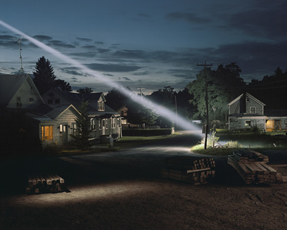
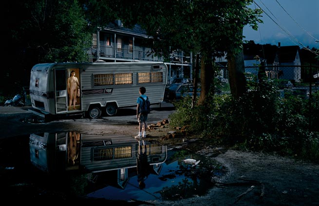
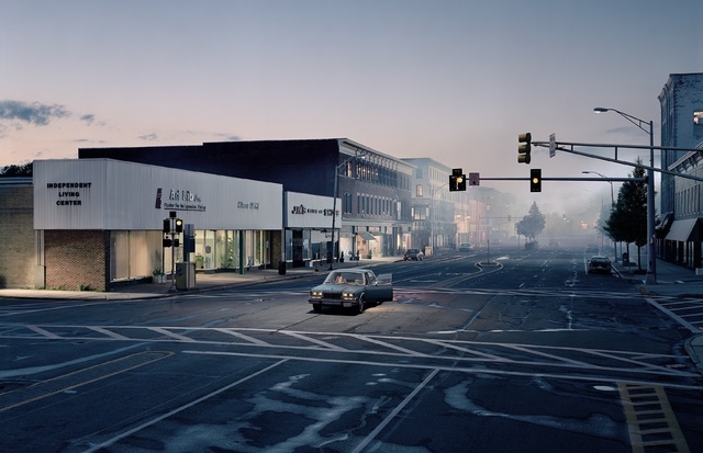
Gregory Crewdson
Untitled from the series 'Twilight'
2001
Digital C-type print
Width 60 inches x height 48 inches
Private collection, courtesy White Cube
© Gregory Crewdson
VISUAL:
The areas that appear clearest are the light beaming from the sky, the houses and the tree. This is because the light from the sky is contrasted with the darker parts of the image, making it stand out. The tree stands out as it is lit up against the dark scenery and the houses take up a part of the image and the shapes of the houses are interesting.
The highlights are on the tree, house and on the floor by the planks of wood. This light is artificial as it has highlights where there may have been shadows but they placed artificial highlights in certain areas to bring them out more. The lighting seems to be harsh except for the house on the right as it looks like it is glowing, which would have been made with a reflector.
The dominant lines in this image are mainly straight. They create direction which can be seen as the light from the sky Is Ieading line to the tree.
This image has dimension and this is created through the use of lighting.
There is no negative space as somewhere in the image there seems to be something happening.
The range of tones in this image from dark to light starts at the bottom of the image and works up to the lighter sky. The contrast between the beam of light and the background is effective as it makes the light stand out.
CONTEXTUAL:
When I see this image, I feel scared as it seems as if something sinister is about to happen. This is due to the use of dark lighting which makes you feel uneasy about the image.
TECHNICAL:
The lighting is artificial and you can see this as the lights are placed in the exact place where the photographer wanted it to be, which he then did to create a scene.
This image makes you feel cold as the colour of the sky is blue and it seems to be taken on a cold, wintery evening.
CONCEPTUAL:
This image is same as other photographers as they create emotion in their images through lighting used.
This may influence me as although you can create emotions through people, you can create them through scenes.
Yousuf Karsh-'look and think before opening the shutter. The heart and mind are the true lens of the camera.'
|
|
Yousuf Karsh was an American-Canadian portrait photographer whom achieved a distinct style in his theatrical lighting. In 1931 he started working with photographer John Powls, in his studio on the second floor of the Hardy Arcade at 130 Sparks Street in Ottawa, Ontario, close to Parliament Hill. When Powls retired in 1933, Karsh took over the studio. Karsh's first solo exhibition was in 1936 in the Drawing Room of the Château Laurier hotel. He moved his studio into the hotel in 1973, and it remained there until he retired in 1992. Karsh was a master of studio lights. One of Karsh's distinctive practices was lighting the subject's hands separately. He photographed many of the great and celebrated personalities of his generation.
Yousuf Karsh's images appeal to me as they lighting is so perfect which makes the images almost seem unreal and drawn. You can clearly see the tones in the faces and the focus of the eyes differ in every image.
Yousuf Karsh's images appeal to me as they lighting is so perfect which makes the images almost seem unreal and drawn. You can clearly see the tones in the faces and the focus of the eyes differ in every image.
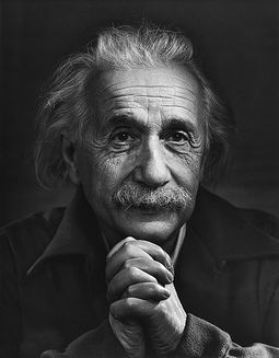
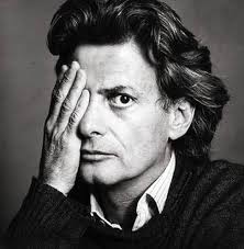
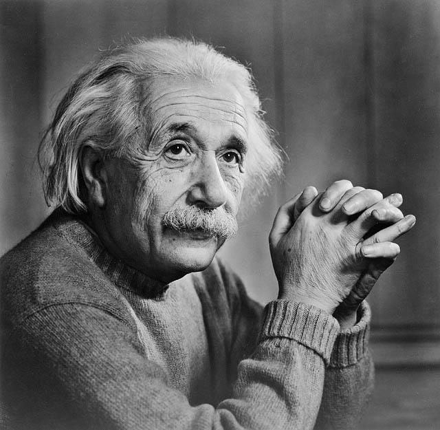
Albert Einstein by Yousef Karsh, 1948
© The Estate of Yousuf Karsh
IPHF Permanent Collection
|
*explained below*
|
VISUAL:
The areas in the image that appears the clearest is the side of the face and hands in which the light is shining upon.
The highlighted shadows are on his face and this is effective as half his face is shadowed and half is brightened, which creates the impression that he has a good side and bad side. I think that the light is artificial as the lighting in this image is created the way the photographer wanted it to. Furthermore, this light seems reflected as the shadow isn’t bold but soft and gentle.
The lines of his facial features are sharp and bold which may signify the age of Albert and his dominating role in life.
His hands seem three dimensional and this is created by the shadowing that is on his hands themselves. As you can see, the light and the shadow on his hands almost split them into halves and the shadowing at the back with the light at the front makes them look 3d.
This image seems like a 50/50 positive/negative space as you can see his face and hands first but then it is balanced with the dark background and the colour of his suit.
The contrast in this image is extremely effective as the darker colours really bring out the lighter colours and the lighter colours make the darker colours seem harsh and bold.
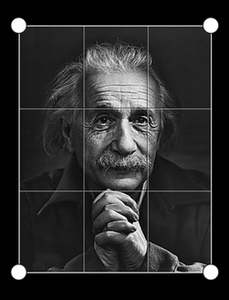
The rule of thirds (shown in above image) is really well applied in this image as the horizontal lines are perfectly lined up with his eyebrows and chin. Also, his facial features are all within the middle of the image which makes them the first thing you see. His hands are also all within the same segment and this makes them a focus point together.
CONTEXTUAL:
When I see this image, I get the sense that the person has an important role in life. This is because he has light on his face which may signify he is angelic or a role model.
The areas in the image that appears the clearest is the side of the face and hands in which the light is shining upon.
The highlighted shadows are on his face and this is effective as half his face is shadowed and half is brightened, which creates the impression that he has a good side and bad side. I think that the light is artificial as the lighting in this image is created the way the photographer wanted it to. Furthermore, this light seems reflected as the shadow isn’t bold but soft and gentle.
The lines of his facial features are sharp and bold which may signify the age of Albert and his dominating role in life.
His hands seem three dimensional and this is created by the shadowing that is on his hands themselves. As you can see, the light and the shadow on his hands almost split them into halves and the shadowing at the back with the light at the front makes them look 3d.
This image seems like a 50/50 positive/negative space as you can see his face and hands first but then it is balanced with the dark background and the colour of his suit.
The contrast in this image is extremely effective as the darker colours really bring out the lighter colours and the lighter colours make the darker colours seem harsh and bold.
The rule of thirds (shown in above image) is really well applied in this image as the horizontal lines are perfectly lined up with his eyebrows and chin. Also, his facial features are all within the middle of the image which makes them the first thing you see. His hands are also all within the same segment and this makes them a focus point together.
CONTEXTUAL:
When I see this image, I get the sense that the person has an important role in life. This is because he has light on his face which may signify he is angelic or a role model.
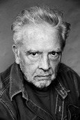
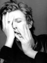
We took images inspired by David Bailey. We chose Bailey as an inspiration as I really like the way in which he creates emotion and how he sometimes uses shadows to do this.
We were influenced by the image on the right, which is David Baileys, to try and create something with elements within it.
Firstly, we wanted to have shadows to make the image more interesting so we had the umbrella light on the right on a dim light and the light on the left was on the lowest brightness. This created shadows but only slightly so we could focus on emotions.
The use of the big coat was to dominate the image and make it have texture. The lines in the fur are in a messy arrangement which brings out personality with the character. Furthermore, if you were to feel the image, it would seem soft as the fur on the coat looks fluffy and light.
This image has 50/50 positive/negative light and the contrast of black and white makes image string as they both make each other stand out.
We used a reflector board on the shadowy side of the image as we wanted them to appear as soft light, which we achieved as we wished.
We used the rule of thirds and made his eyes fit on one of the horizontal lines. This was to make his eyes a focus point as we tried to create emotion within them.
