What I think about Belgrave Architecture
Growing up in Belgrave, I have found the architecture generally old and boring however, looking into it in more detail has made me realise how different the architecture is compared to other places. We took a trip down Belgrave road and took a series of images of some types of Architecture that were there.
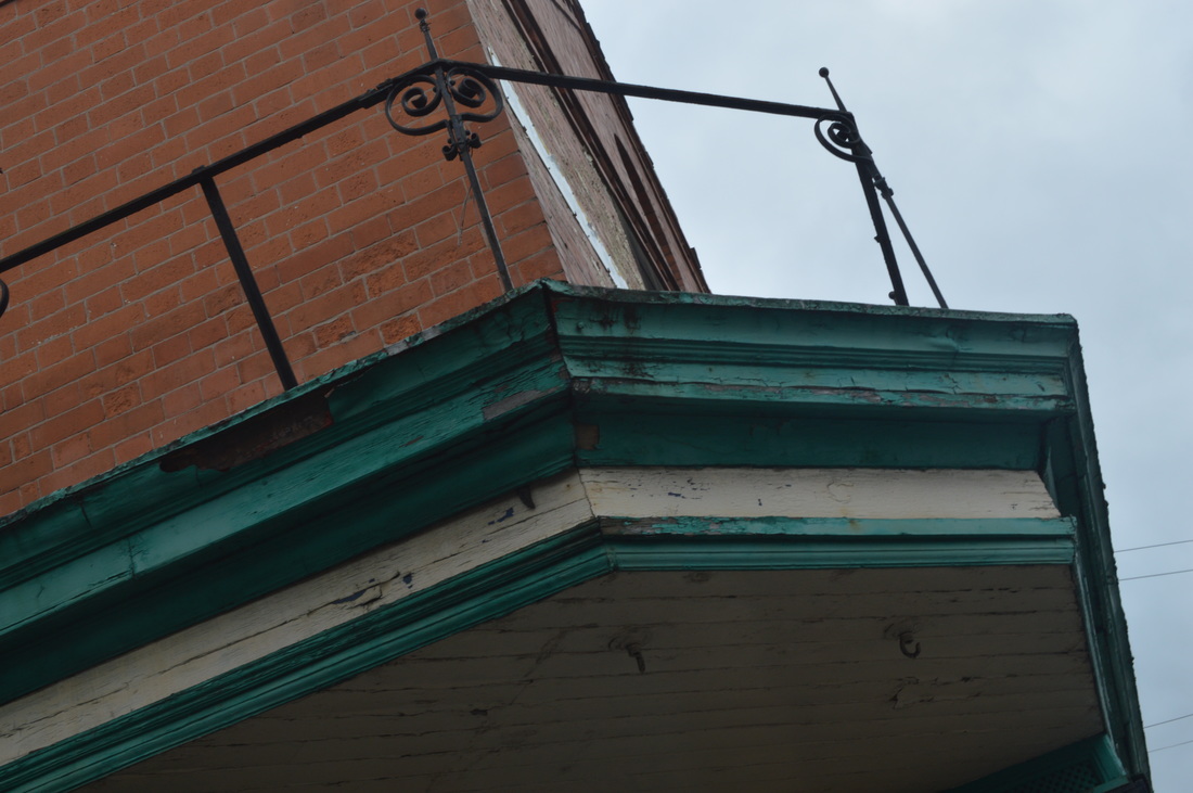
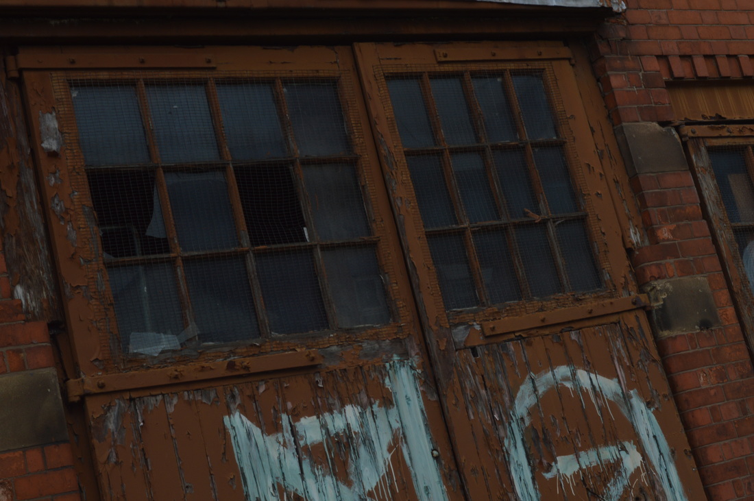
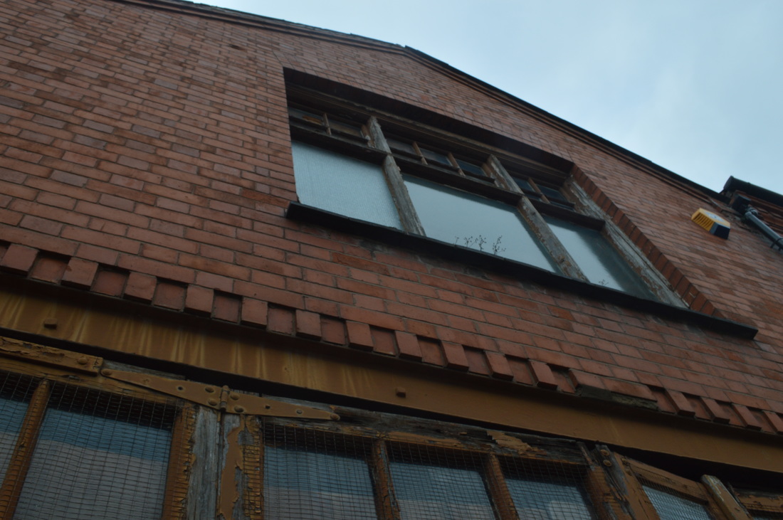
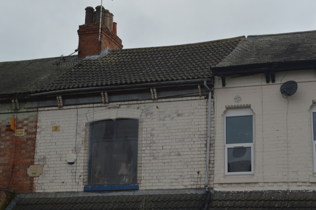
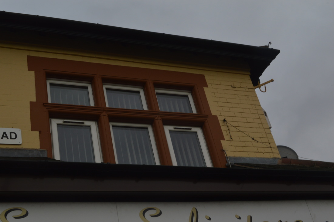
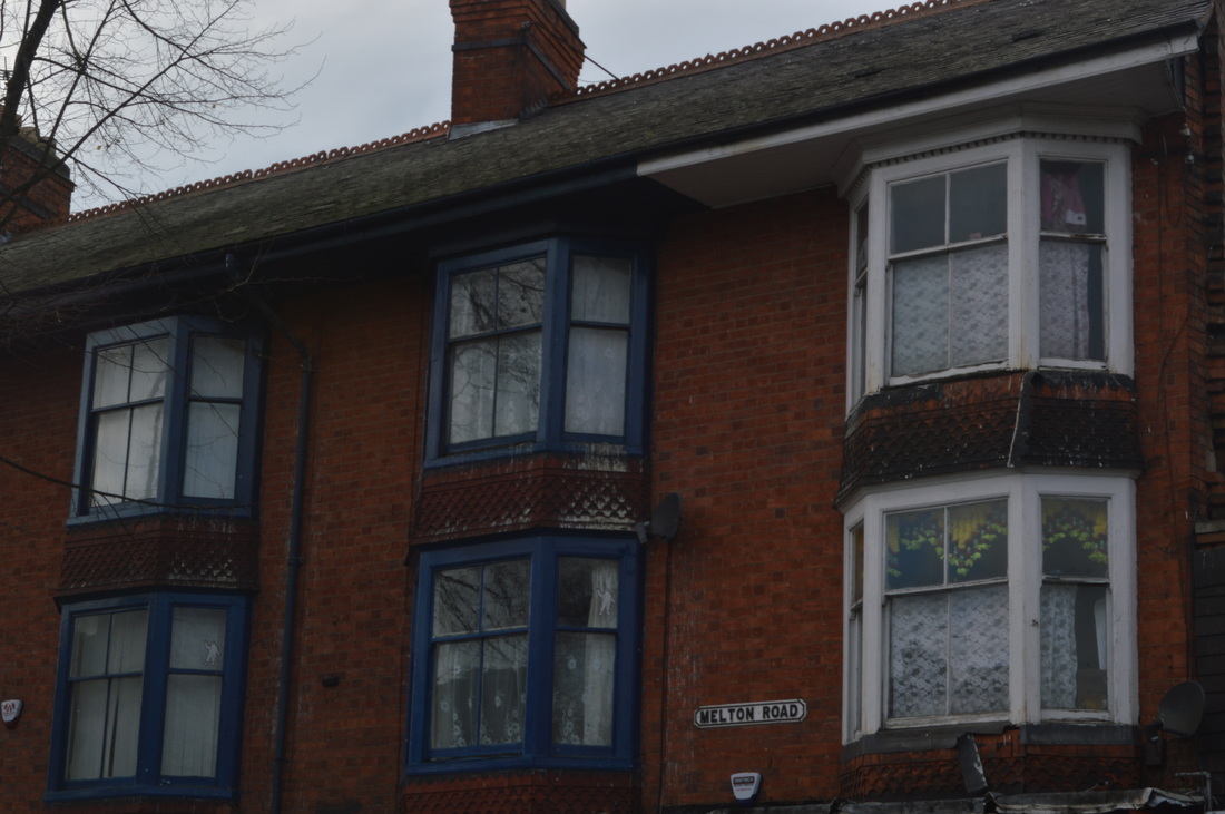
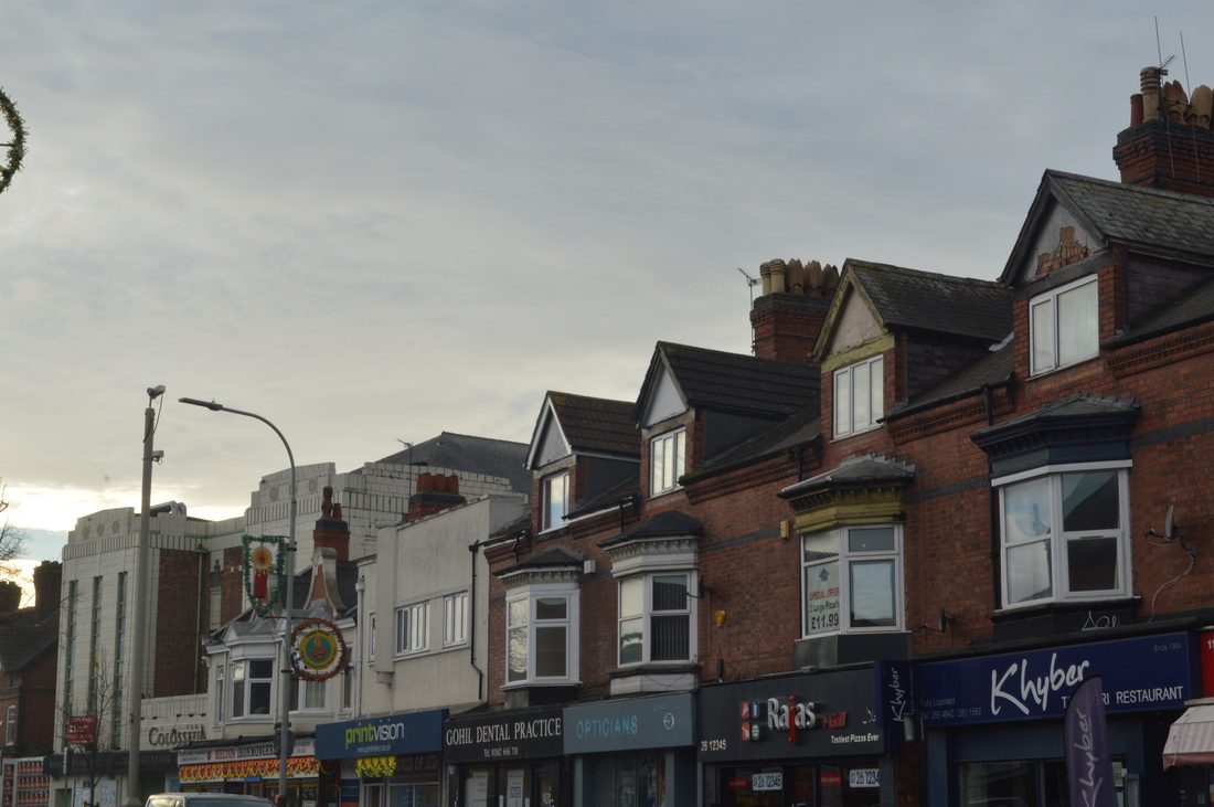
I did like a few buildings as the design of them were interesting eg. the Victorian windows, the shape of some old pubs and the abandoned garage. Belgrave road had recently painted some of the buildings in a line making them colourful but if you saw the buildings on either side of them, it looked bad (as it stood out too much.)
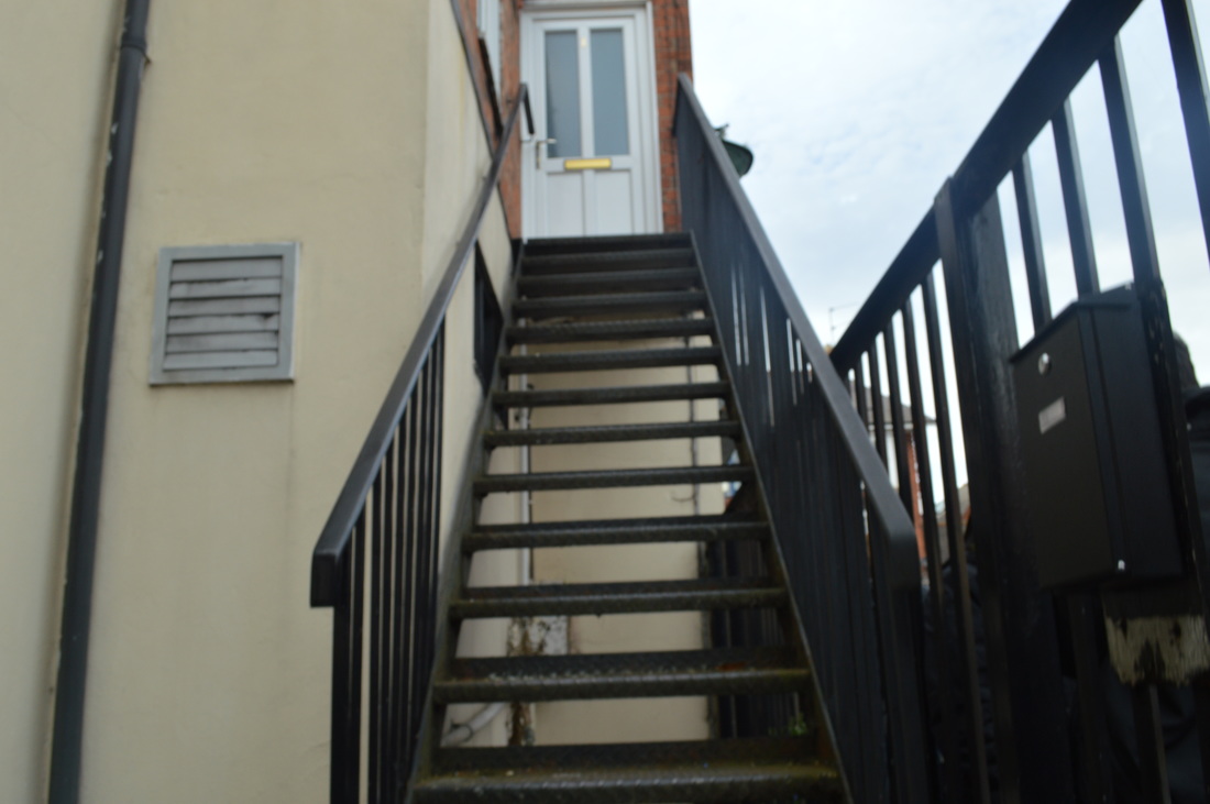
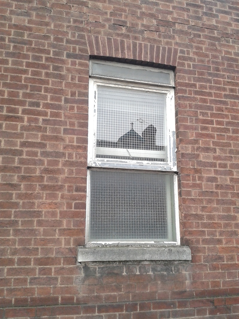
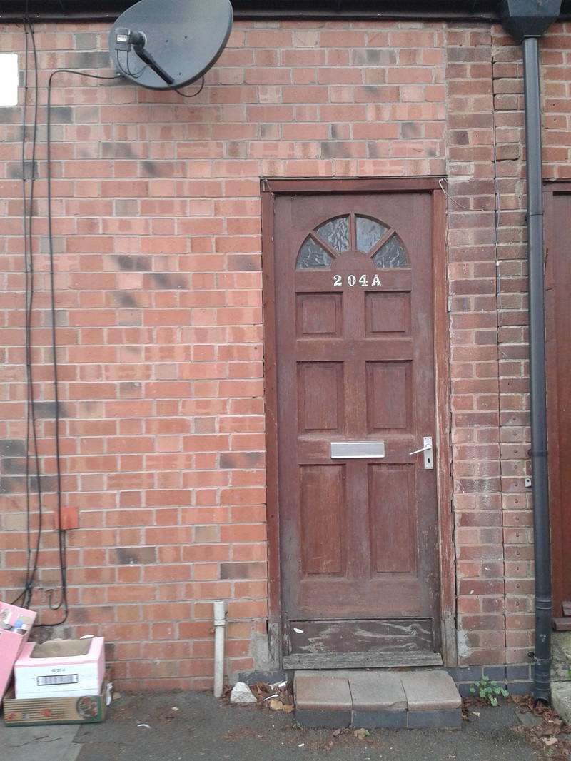
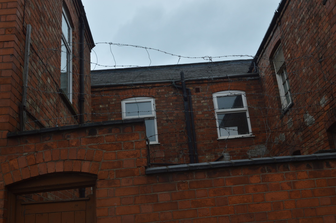
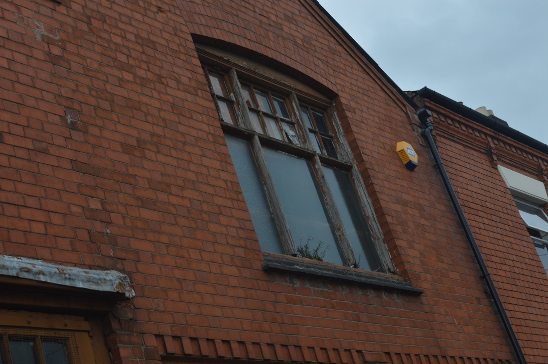
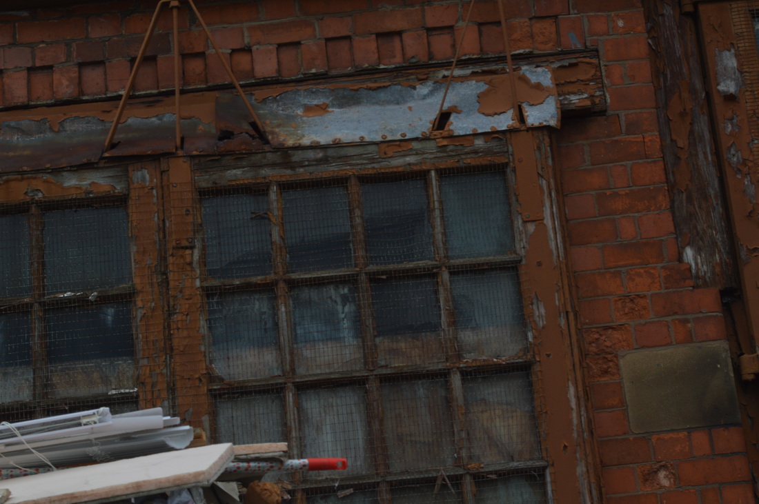
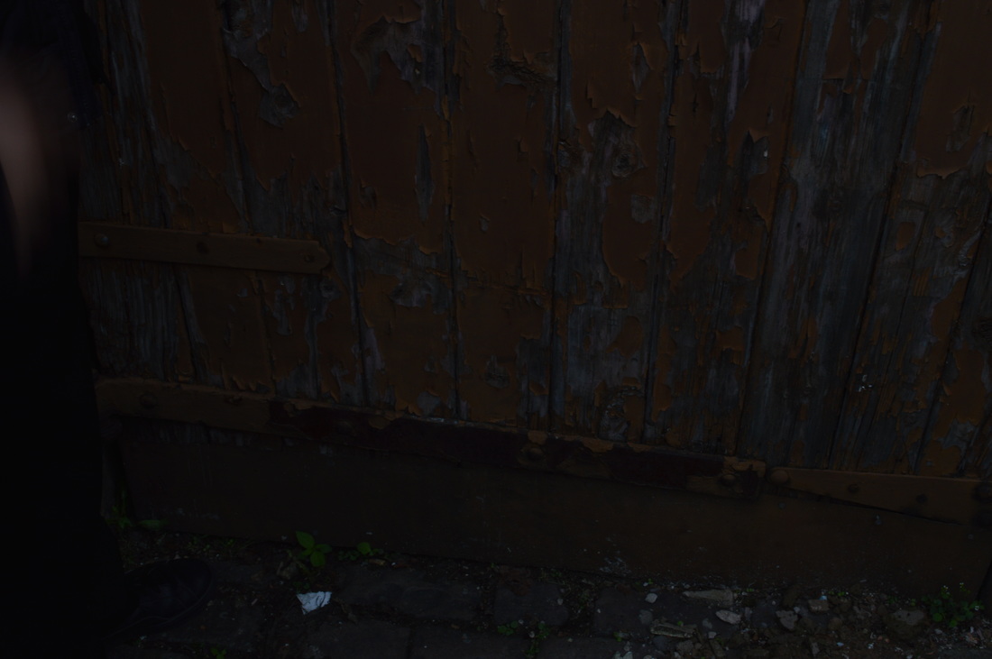
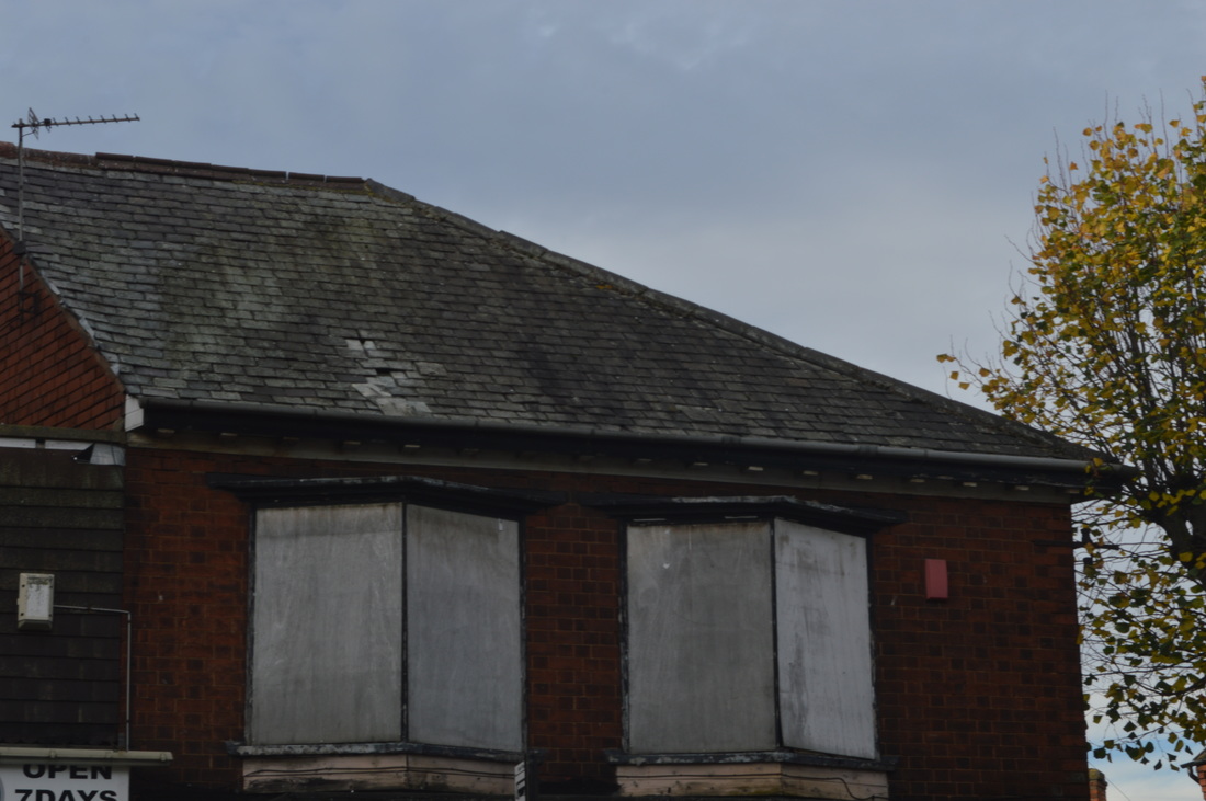
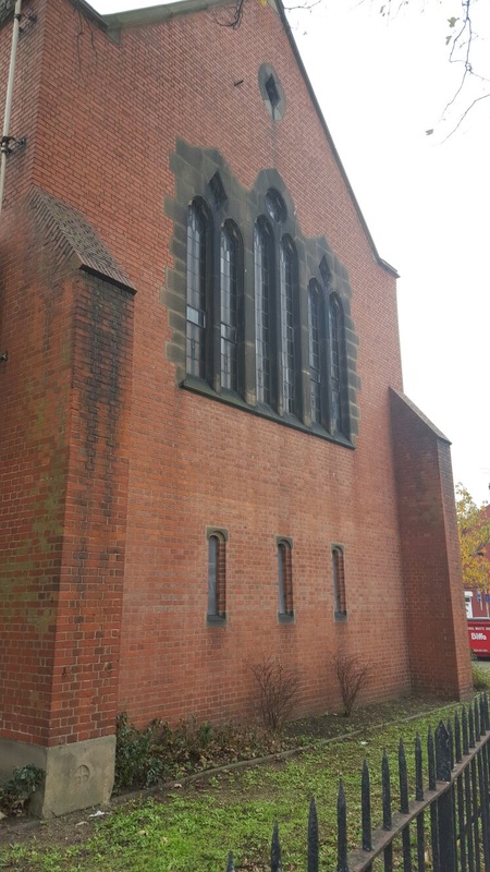
On the other hand, most of the architecture didn't appeal to me. I found it quite dull as most of them were bricks, the walls were rotting which looked 'ugly' as well as the moss stairs and finally, it was all extremely old! You could tell from the styles of the buildings and the pillars that were around houses that the buildings must have been there for quite a while. Also, a lot of the windows were either boarded/brickedor they were the old fashioned windows which are uncommonly used now.
If I were to change anything about the architecture on Belgrave road, I would make it look modern and have the buildings bold and all unique shape/sizes. Belgrave road is a really common place and therefore, you would want something that would look interesting and appeal to everyone. I would also make the buildings out of something other than bricks (like the architecture in Birmingham) to make it look classy and interesting.
I did like a few buildings as the design of them were interesting eg. the Victorian windows, the shape of some old pubs and the abandoned garage. Belgrave road had recently painted some of the buildings in a line making them colourful but if you saw the buildings on either side of them, it looked bad (as it stood out too much.)
On the other hand, most of the architecture didn't appeal to me. I found it quite dull as most of them were bricks, the walls were rotting which looked 'ugly' as well as the moss stairs and finally, it was all extremely old! You could tell from the styles of the buildings and the pillars that were around houses that the buildings must have been there for quite a while. Also, a lot of the windows were either boarded/brickedor they were the old fashioned windows which are uncommonly used now.
If I were to change anything about the architecture on Belgrave road, I would make it look modern and have the buildings bold and all unique shape/sizes. Belgrave road is a really common place and therefore, you would want something that would look interesting and appeal to everyone. I would also make the buildings out of something other than bricks (like the architecture in Birmingham) to make it look classy and interesting.
Best 3 images
|
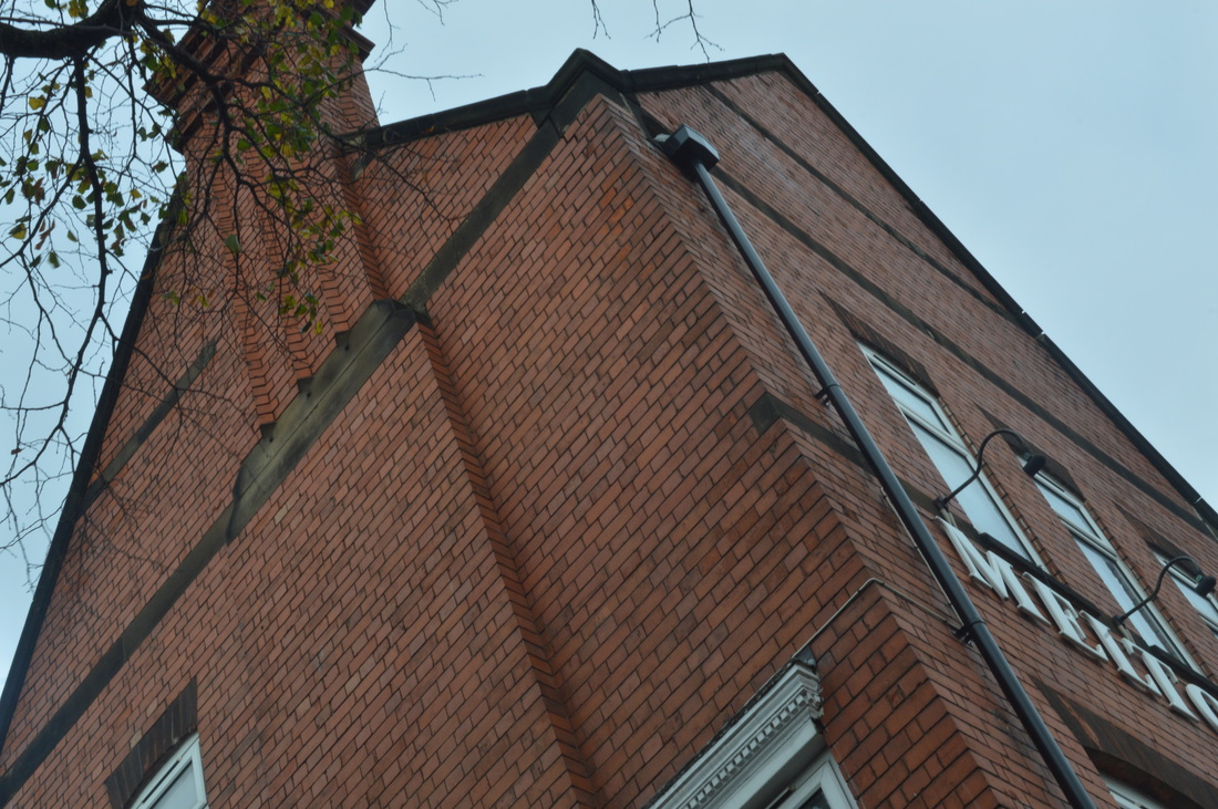
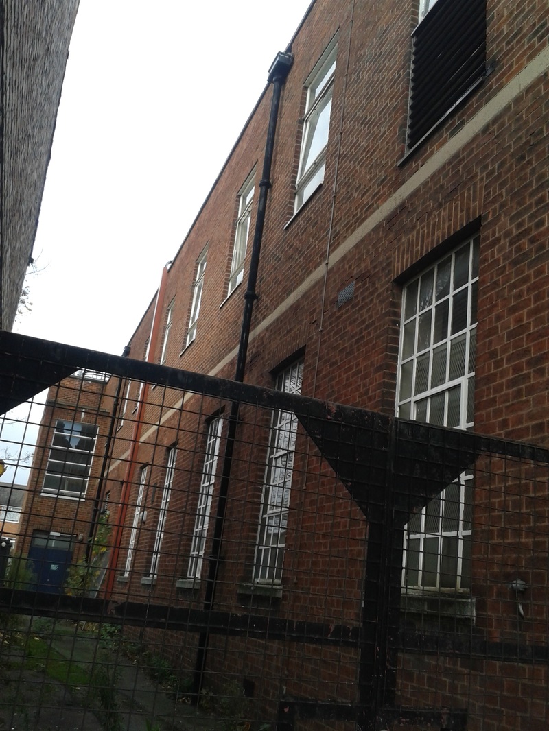
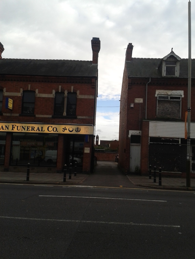
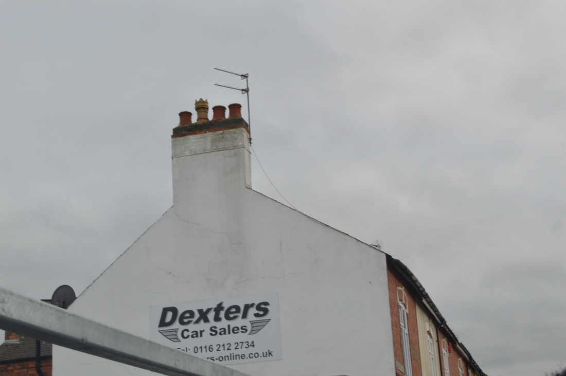
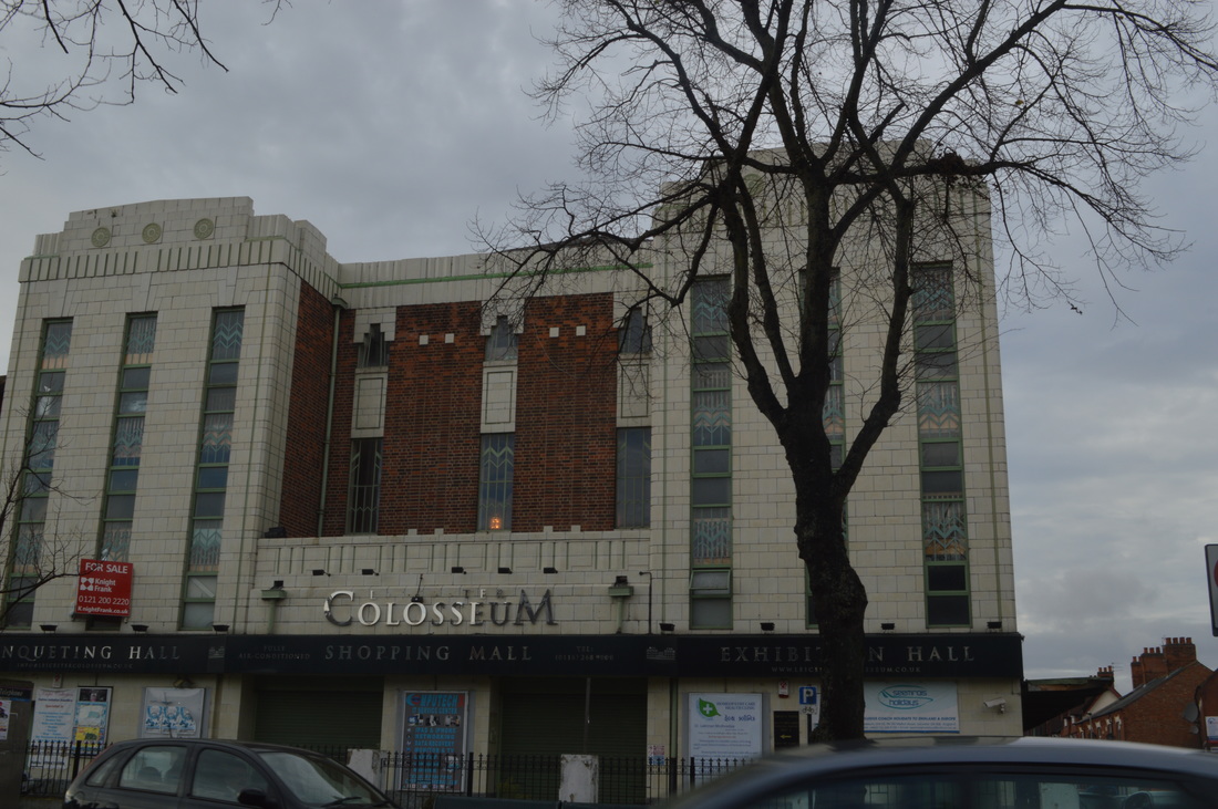
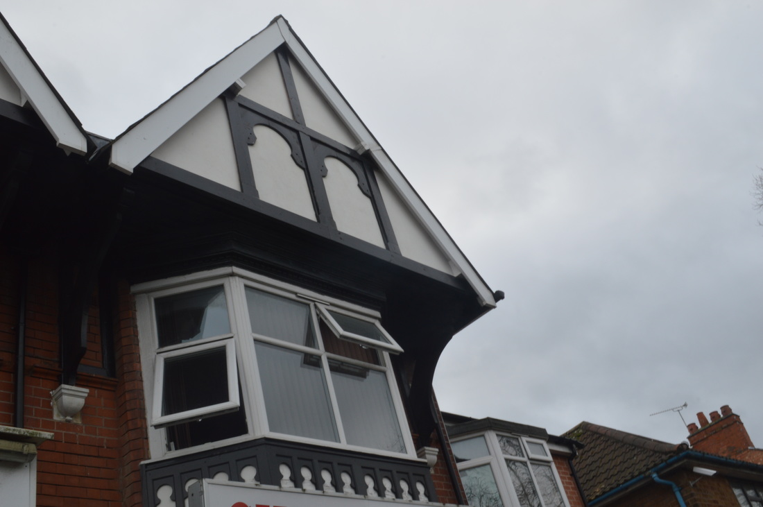
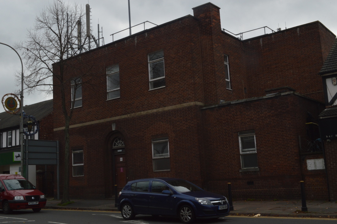
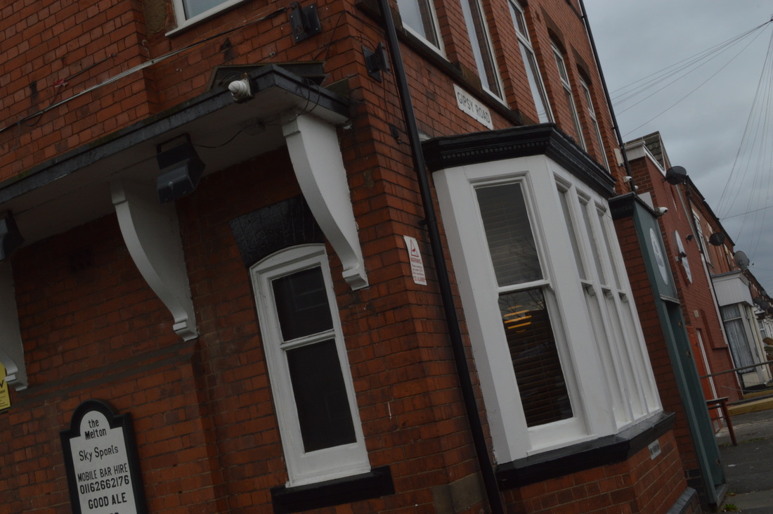
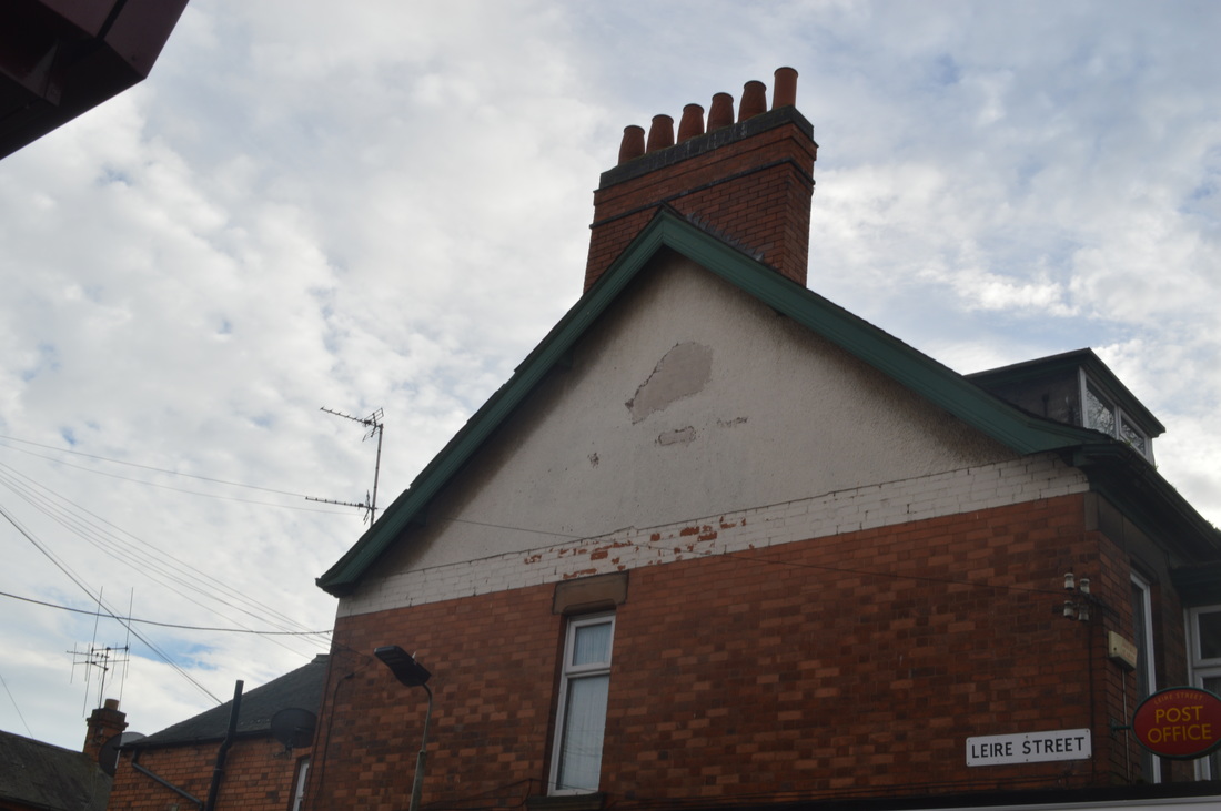
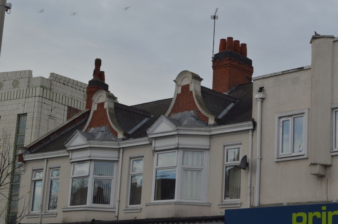
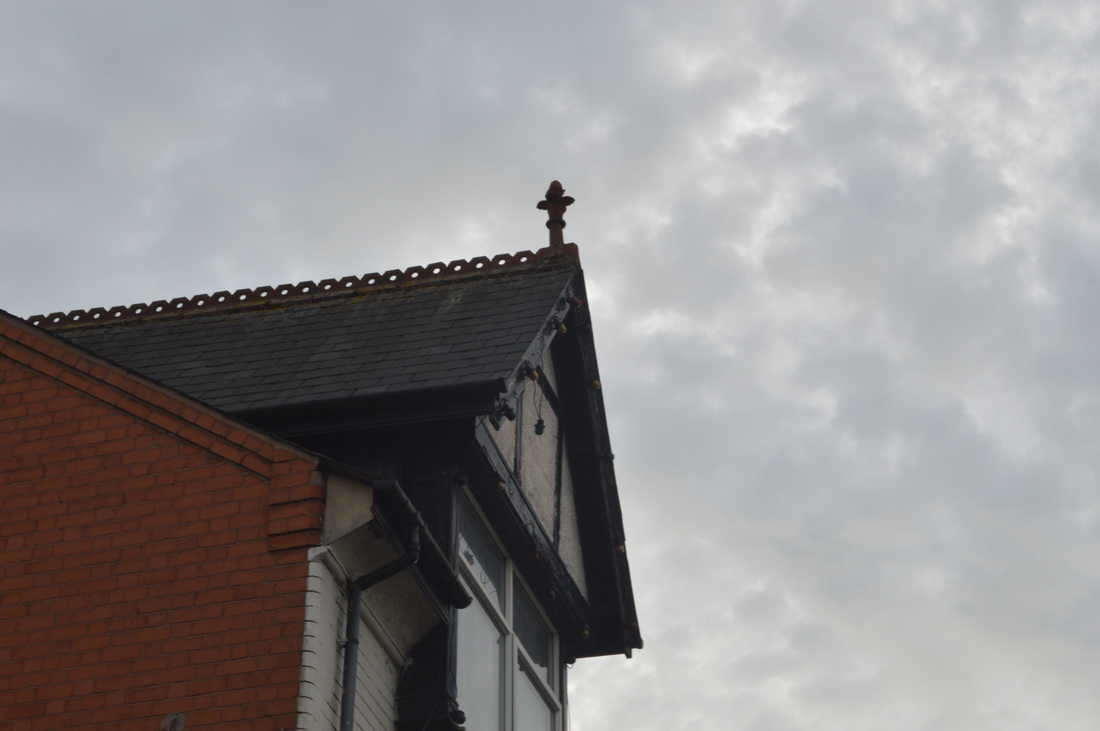
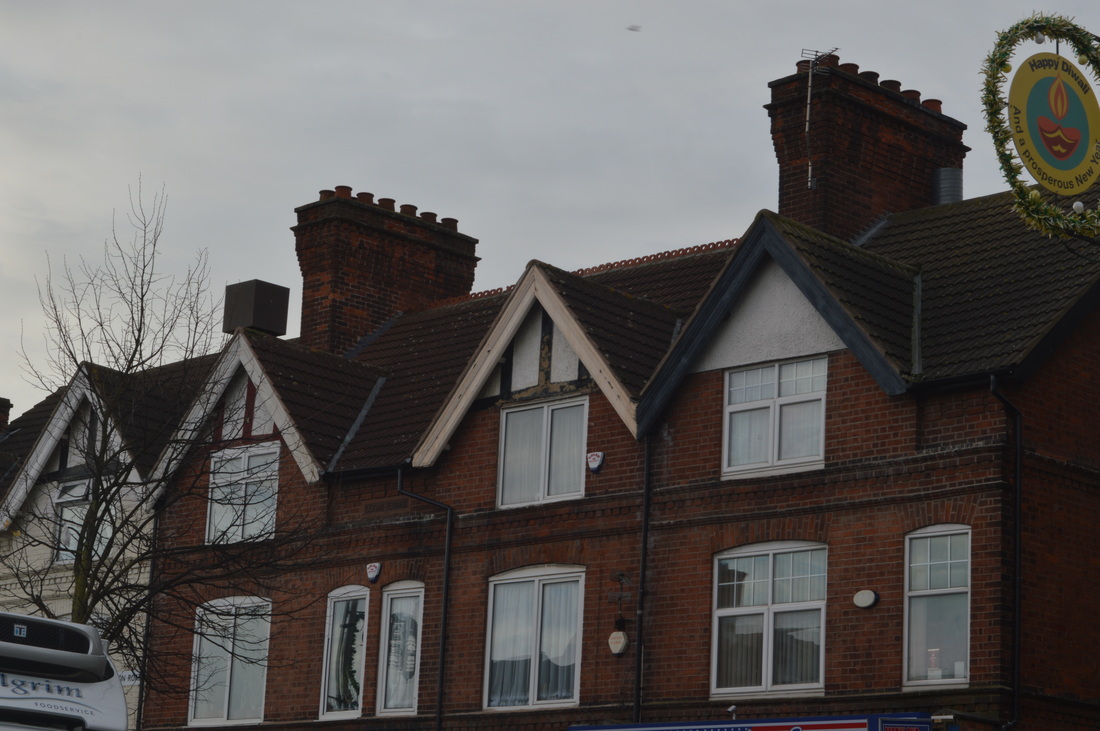
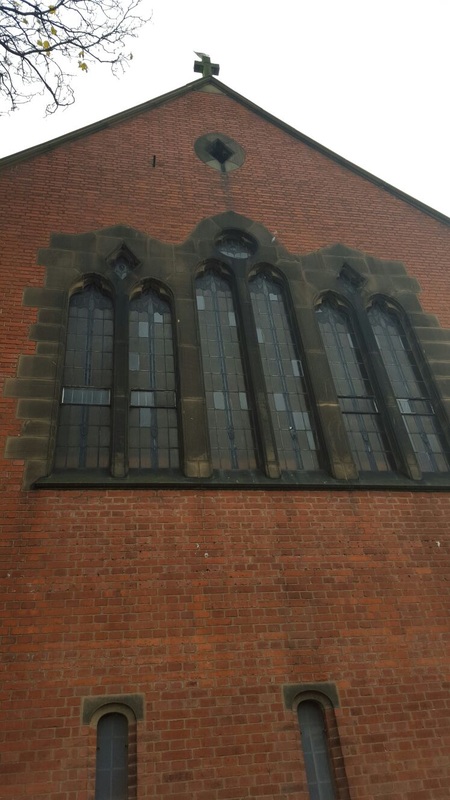
In this image, the tree was in the way, making it the focus point when it was meant to be the building. The lighting in this was natural, soft daylight and it makes the building stand out in the clear sky. The dominant lines in this image are the zigzagged ones that stand out of the building for example, on the chimney the lines are eye-catching as they are unusual and they have an strange shape to it. Moreover, what also makes this image interesting is the 3d effect that the chimney gives. It doesn't look like a standard 2d building but it has defined shapes which completely stand out amongst the regular buildings. The 3d effect is created by the way the bricks are placed and this is interesting as they are not placed straight but, in a zigzagged form. There is also depth in this image from the shape of the building and the way the angle is. I took this from a 'worm's eye view' which shows that this building seems more superior to myself. This can show that the building has control and is important for us to look up upon. By looking at this image, if you were to feel it, it would have a rough texture as bricks are coarse and you would be able to feel the jagged edges and corners. There are a range of tones in the bricks with the colour brown. This could be due to the oldness of the bricks and how some of them have worn away and lost colour.
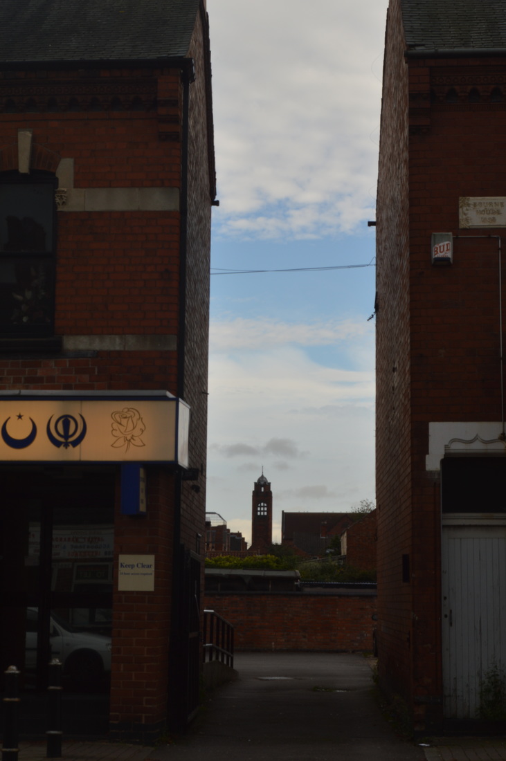
This image has two composition aspects within it, leading lines and angles. The leading line of the chimney makes your eyes follow it towards the top whilst the angle of this image shows the different shapes of the building. |
|
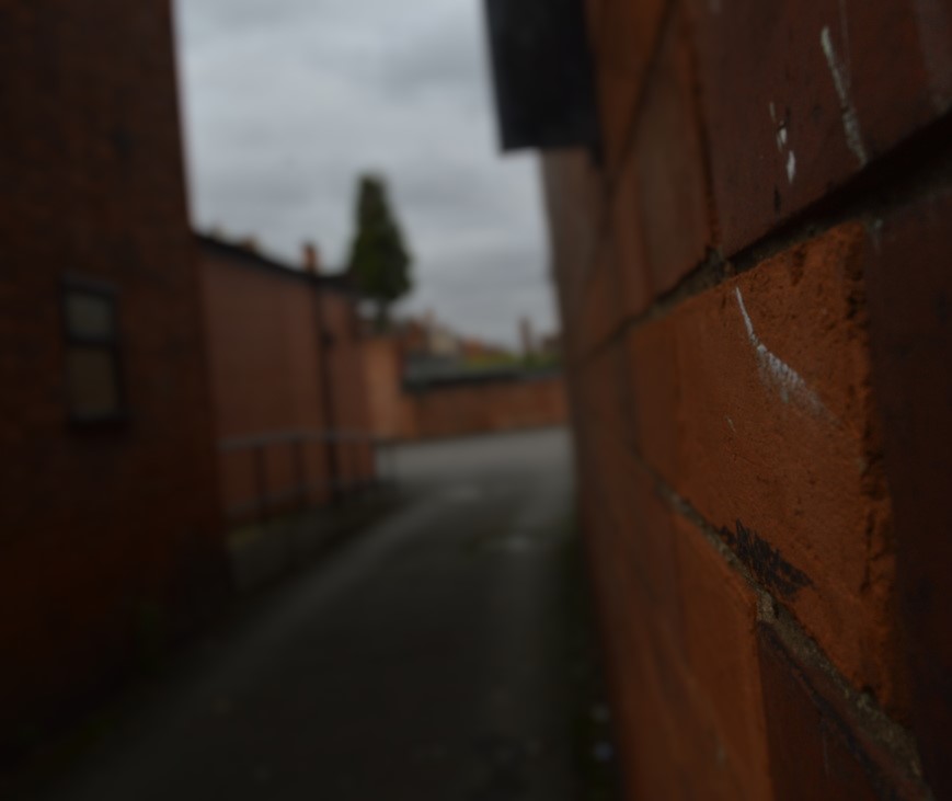
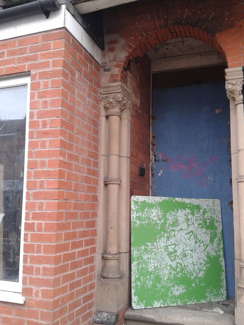
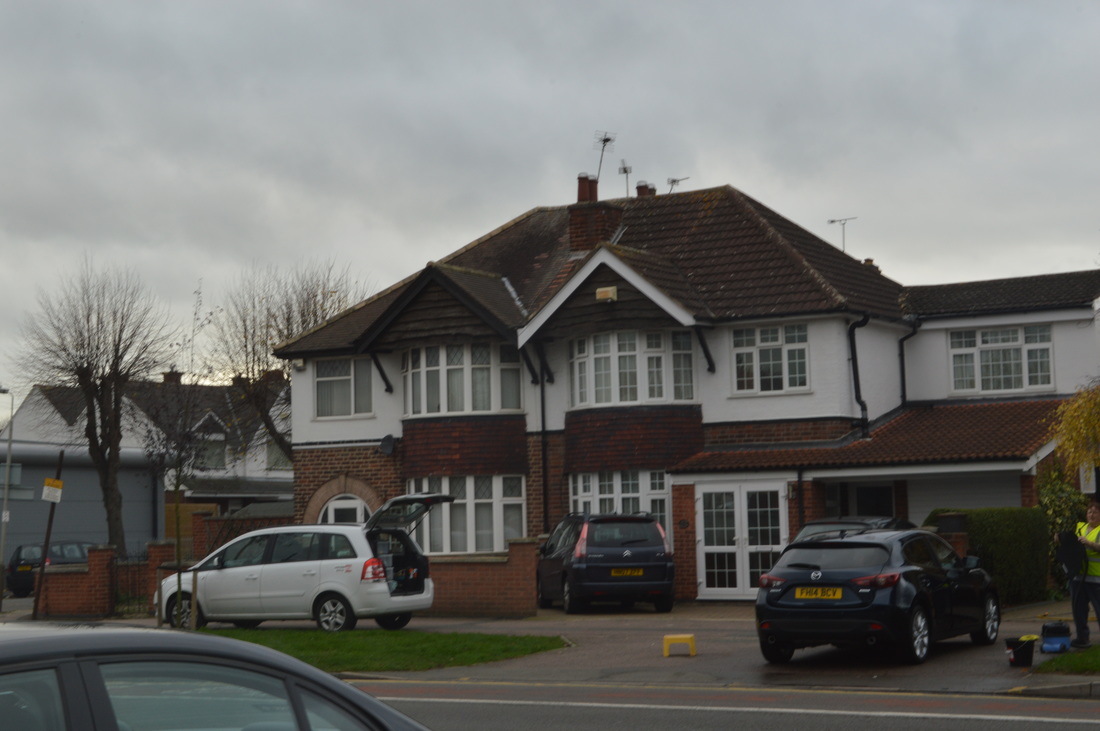
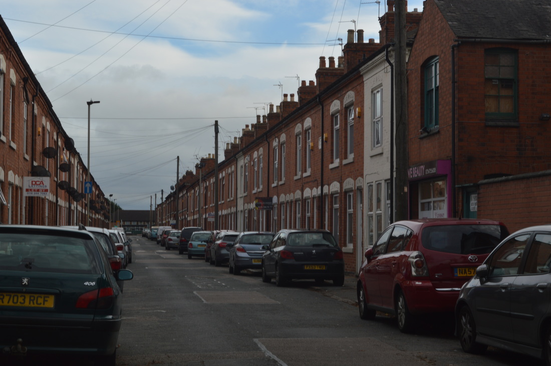
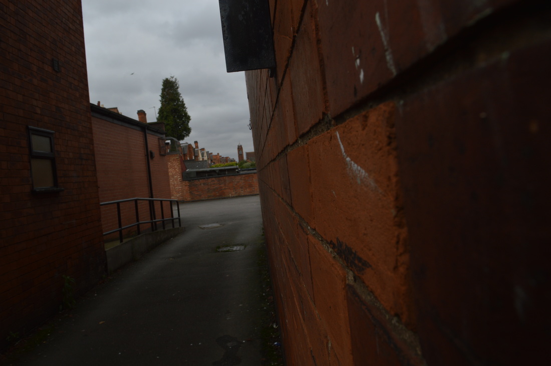
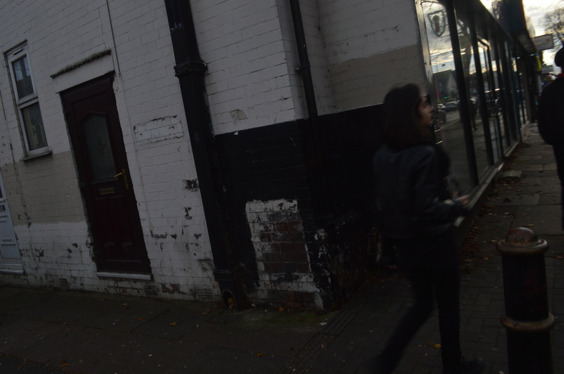
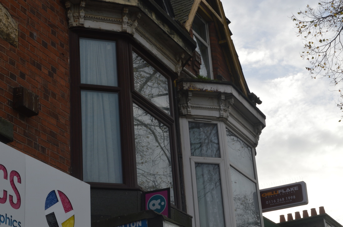
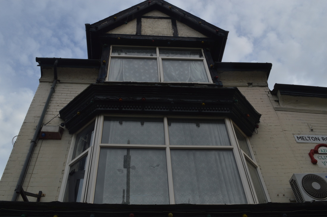
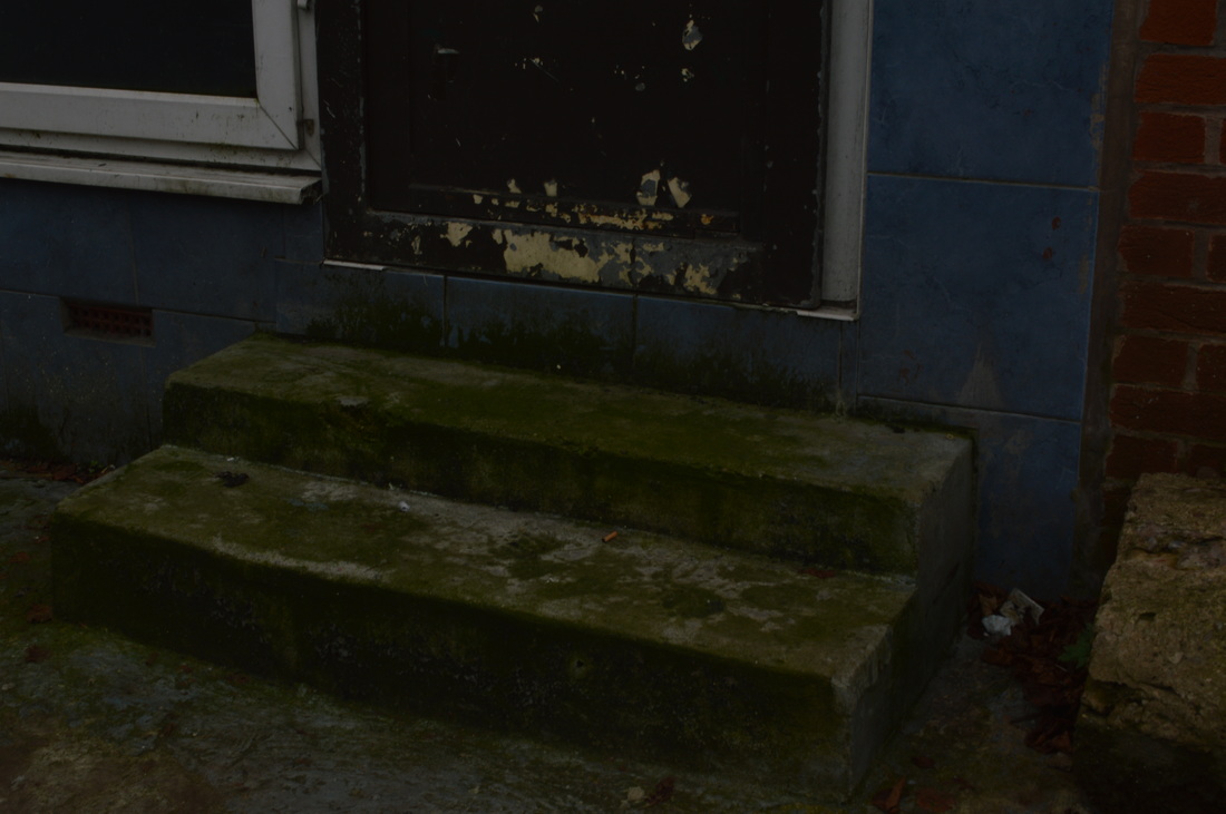
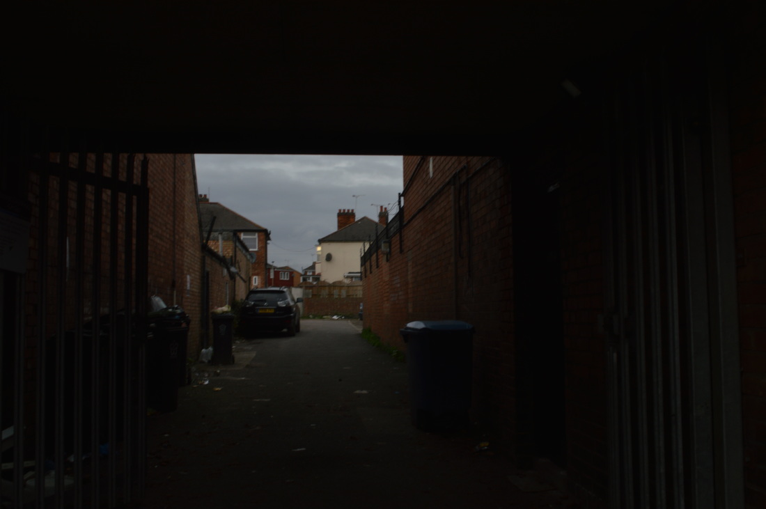
In this image, I achieved using a low-f stop number. The area which appears the clearer is the area at the front whilst the background is in a blur. The lighting in the image makes it seem like a dull day, in which it was and also, the colour of the wall is sombre which adds to the effect of a dull day. The strong lines in this image are the leading lines within the bricks and the pathway as they make your eye follow them down to the back of the image.
|
|
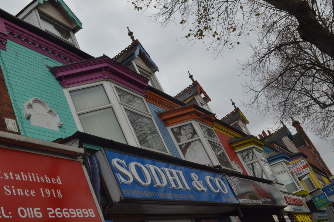
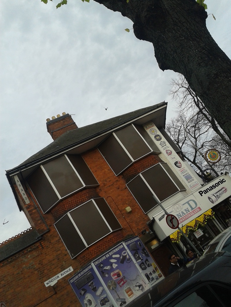
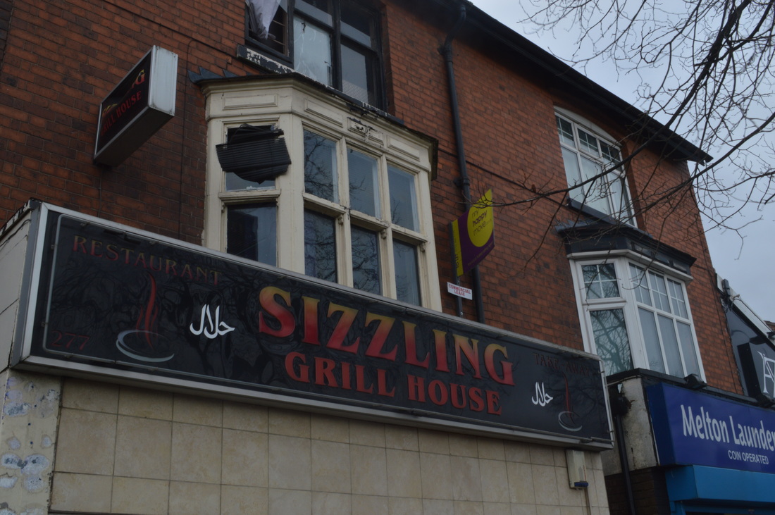
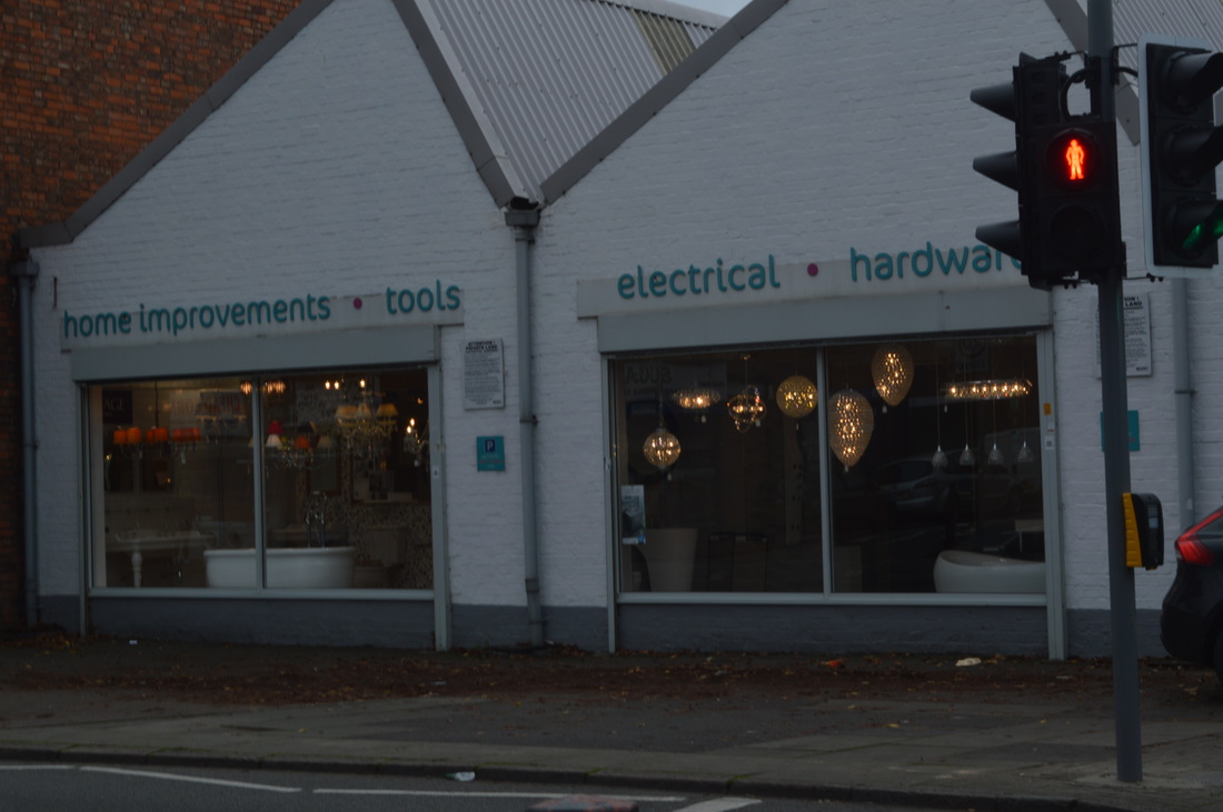
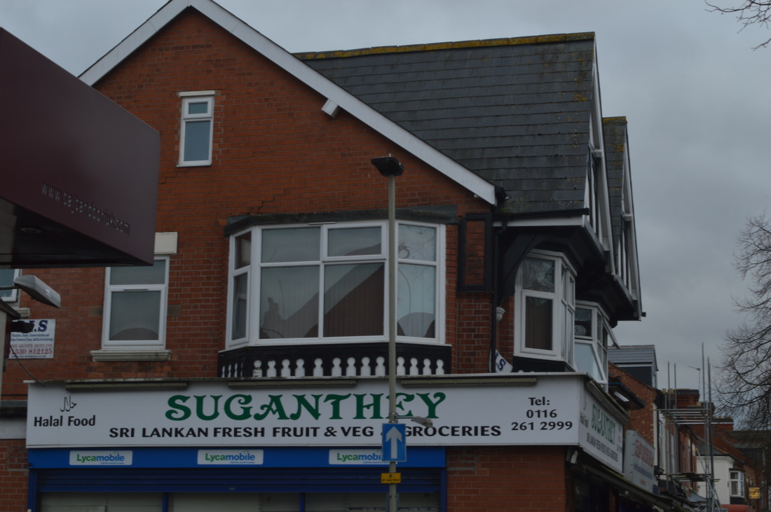
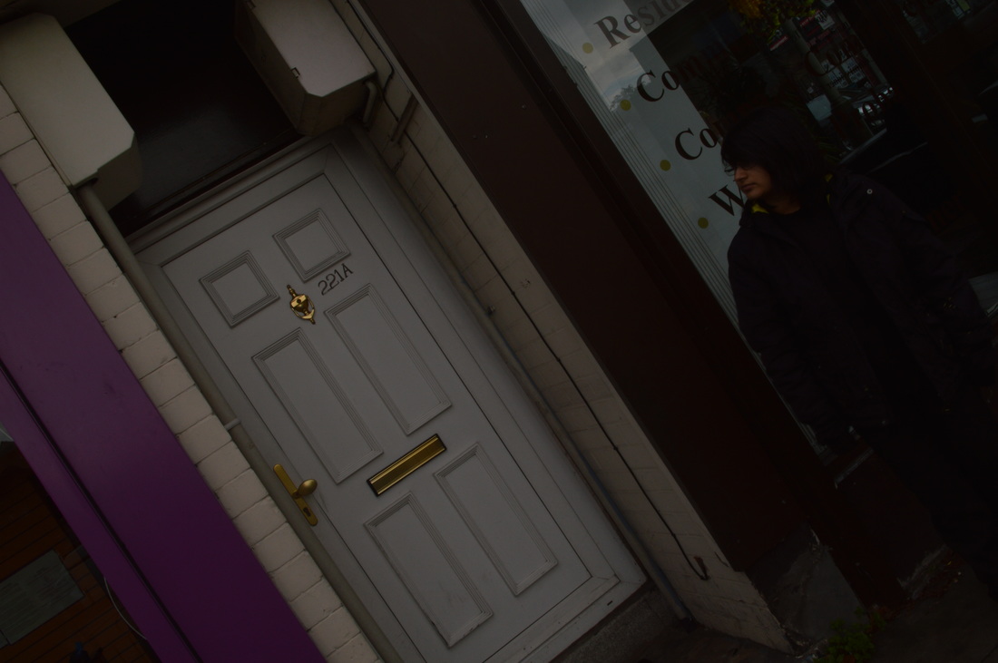
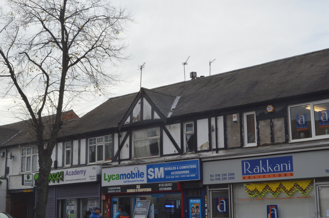
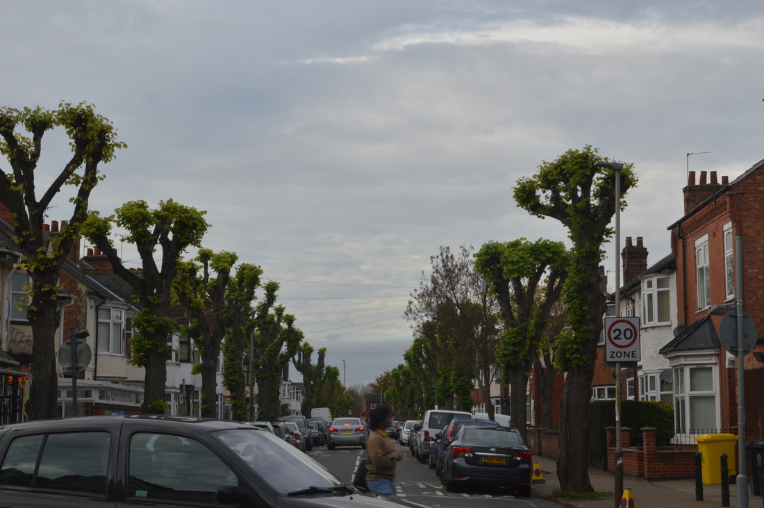
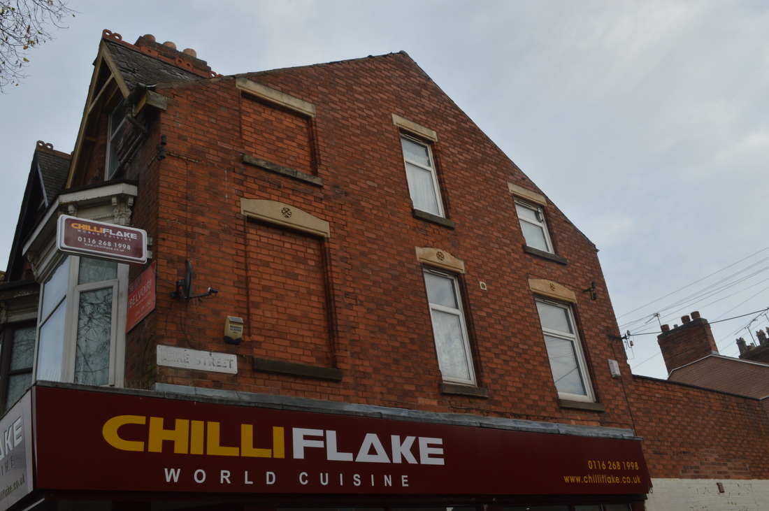
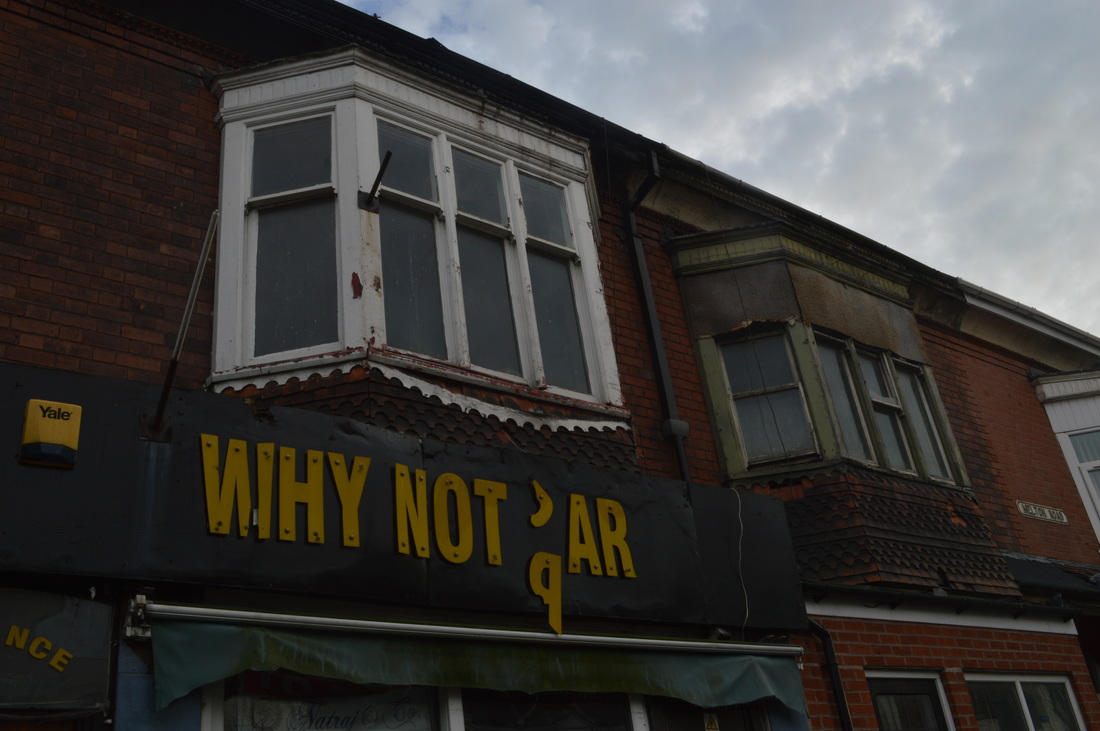
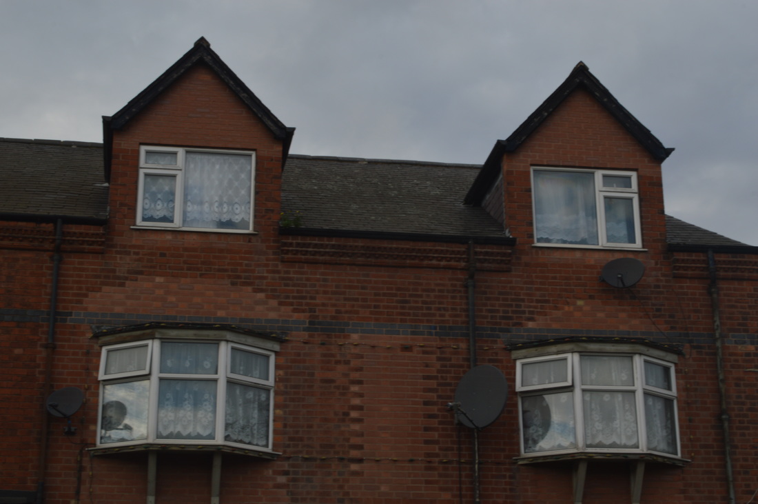
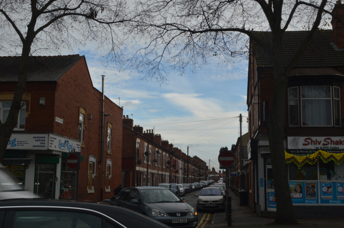
Finally, I really like this image. You immediately see the colour and the signs are unclear straight away which is effective as it shows how eye-catching the colours are. The colours are contrasted with the sky as they are bright and the sky is dull which attracts you away from the sky. Also, the repetition of the windows is extremely effective as it looks as if it has been cut and pasted throughout the street.
|
Other Images


Contact Sheet
