I redid my final piece as I wasn't happy with my first one:
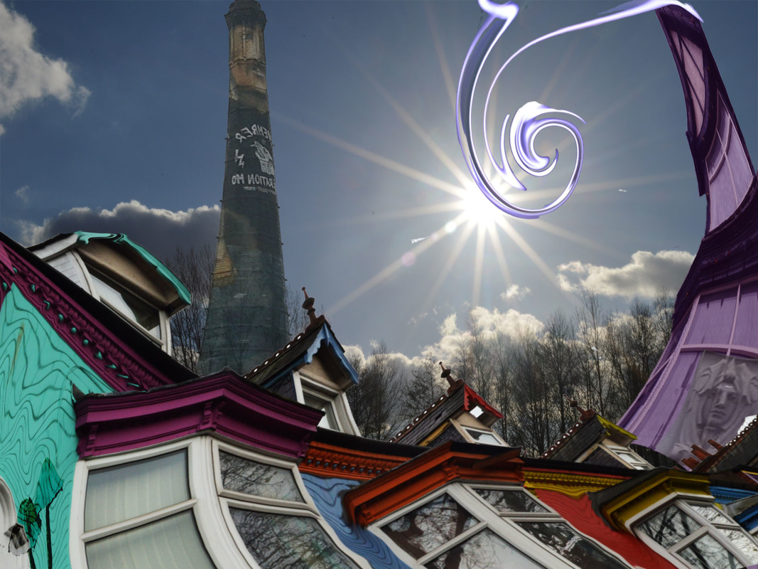
I have used my images to create a final piece on my take of architecture. I have combined certain images on photoshop to create something that looked fun and interesting as throughout the project, I have found that architecture can be made into something fun if you change the slightest things. Im glad I had redone this as in my first final piece, I wasn't sure about tying new things as I wanted my image to look good however, I have found that coming out of my comfort zone has really affected my image that I have created.
I used this background in particular as it looks joyful because of the blue skies and the sun. Although the trees look quite tacky, I wanted elements of nature to contrast with the man-made buildings. This was effective as the buildings stand out a lot more than the trees which can show how architecture is overpowering nature.
The coloured row of houses at the front represent how I would want architecture to look like. Its bright, fun and catches the audiences attention. Im proud with how this turned out as generally, it looked quite out of place in the belgrave area but by changing a few features of it, it looks extremelly better. I cropped the lower half of the houses out as the dull bricks made it weak since the top half is bright and colourful and moved to the bricks which took focus off the colours. I then made the brightness higher so the colours were more stronger than they were. As I said in my last final piece, I wanted to come out of my comfort zone to create something that looked strange but made the image work really well. I used the warp tool to change the shape of the building. I curved it so that it fitted well within the golden ratio (explained in detail below). Then I used the perspective tool to make it look as if it was on a diagonal slant, so I could create dimension within the image to make it look eye-catching. The repetition in the chimneys from left to right made the building look 'normal'. I wanted to take away the sense of normality in my work as I feel as if, if people saw it, it wouldn't stand out. I removed the top half of the turquoise roof as the leading line is swift down the others and suddenly comes to an abrupt ending. I don't think most people would do this however, I wanted it to be unique and show that the normal isn't always a good thing. I like how my background and the windows in this image connected as in the windows, there is a reflection of trees. It would have seemed odd if there was a reflection of trees if there weren't any in the image, therefore i'm glad this worked well together. During this project, I realised how standard bricks were in architecture and I wanted to show how they can be made to look different rather than boring and colourless. I used a liquify tool to make the bricks look dripped as I thought that it takes away attention from the building and makes the features of the building stand out more. The vibrant colours work well together and the orange and blue seems odd however they are contrasted and they compliment each other.
I like the use of mushrooms in this image as it almost seems like they are engraved into the building, and this also shows how architecture seems to be overpowering nature in the modern world. I used a burn effect on the mushrooms and then made the opacity lower so that you can see the wall pattern through the wall. This was to make it look like they were stuck into the wall.
I used an image from Birmingham which is the graffitied chimney. I thought that my work was lacking architecture itself after I thought I had finished, and then I had the idea of adding this into the image. It works with my image as it shows the uniqueness of a chimney since most chimneys are standard. I warped it so that it largened at the bottom which makes it seem as if it is coming out of the houses. I made the opacity of it quite low so that it didn't stand out too much as I wanted the houses to be the main focal point. I placed it where it is as I wanted to have it in line with the rule of thirds (explained below).
The victorian building was really hard for me to use as it seemed boring and old whereas I wanted my image to be fun and modern. I then started changing a few things of it and was pleased that it worked well. I made the colour of it almost lilacy as I don't think I have ever seen a purple building, therefore I wanted to incorporate something into my image which was different. I warped the building so that it lead off from the houses and I made it curved in order to fit it with the golden ratio (below). The use of the face was to show that aspects of old buildings can be used (as the face was off an old building) to make the normal seem abnormal.
Finally, I used an image from my 'experimenting with light' lesson to make my final piece that extra bit interesting. I had to change the levels of the image so that I could get rid of the unwanted background. Then, I used the 'twirl' tool to make it into a spiral shape. I intended on having it a different colour but I thought that different tones of blue was effective. I led it off from the victorian house so that it looked attached and made it spiral. This worked extremelly well as it fits perfectly with the golden ratio.
John Baldessari inspired me to make my image fun and abnormal as his images make the viewer quite confused. Also, his use of wrong images taught me how to not apply them in my image in order to make it stronger.
Rule Of Thirds: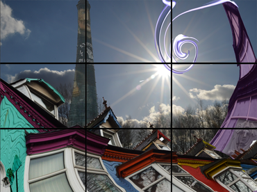
|
Golden Ratio: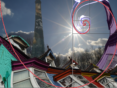
|
As I mentioned in my previous final piece, I wanted to have composition aspects in my image. The rule of thirds was used to help me place things and you can see this through my placement of the chimney. It runs perfectly along the chimney and this makes the chimney stand out as your eyes are instantly attracted to it. Also, the swirl and the sun meet as the crossover of the lines and this makes them stand out.
I used the golden ratio to warp the buildings in my image to make them fit along with the spiral so that your eyes are led in a motion, which brings movement to the image. The houses are curved in a way that moves with the spiral but I particularly made three turquoise dots on the house on the left to run along the spiral (I did this by liquifying them.) The victorian house runs perfectly with the spiral and this is led on through the light drawing and into the middle.
I used the golden ratio to warp the buildings in my image to make them fit along with the spiral so that your eyes are led in a motion, which brings movement to the image. The houses are curved in a way that moves with the spiral but I particularly made three turquoise dots on the house on the left to run along the spiral (I did this by liquifying them.) The victorian house runs perfectly with the spiral and this is led on through the light drawing and into the middle.
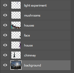
This image shows the layers that I used to create my final image. I had to put them in this order as I wanted some things to be in front of another, for example the 'mushrooms' layer is before the houses layer as I wanted them to appear on top of the houses.
